ALPA Mobile — Component Design Questions
A living tracker of open design-team-facing questions surfaced while mapping the Figma components to the mobile component library. Each item is something we need a design decision or confirmation on before the spec can be called final — distinct from backend data gaps, which live in the Backend API Mapping Report.
Figma file reference
There are two Figma files for this project. Questions below that link to Figma nodes use one of these two files:
| Label used in questions | File ID | What it is | Open in Figma |
|---|---|---|---|
| Base design | owEYzHf7FrHRvWC2u82UOl |
Original ALPA Mobile app design — base components and screens, no MEC customizations | Open base design |
| MEC customization file | gpO3masyyNNHxjvRtdcRo7 |
Copy of the base file extended by Interactive Strategies — contains the per-airline MEC screens (UAL, FDX, DAL) and design annotations | Open MEC file |
How to use: design reviews each open question, records the decision in the Design answer row, and we fold it back into the affected component spec(s). Resolved items move to the Decided section with a date.
Open Questions
DQ-1 — Body font: Futura PT token vs Futura LT Pro layer override
Resolved 2026-06-22
What we found (from the Figma source):
- The design-system variable
Font Family/Bodyresolves to "Futura PT" (alongsideFont Family/Heading= Lora,Font Family/Eyebrow= Inter). - The canonical Home screen (node
4099:5230) renders only Futura PT — its generated code usesFutura PTBook / Demi and no "LT Pro". - However, a handful of standalone component frames' text layers — the Button
and Button Group labels and the marketing Hero illustration — carry a
direct font override to "Futura LT Pro" that bypasses the
Font Family/Bodytoken.
Why it matters: Futura PT and Futura LT Pro are different physical typefaces. If the overrides are unintentional, those buttons/labels would render in a different font from the rest of the app. Our component library standardizes on the Futura PT token, so today we treat the LT Pro instances as overrides to reconcile.
Ask for design
Is Futura LT Pro intentional on those button / hero layers, or should they be re-bound to the
Font Family/Body (Futura PT) token? If it's a deliberate display face for buttons, we'll add it
to the token set explicitly; otherwise please clear the override in Figma so the layers inherit Futura PT.
Design answer (2026-06-22): Futura PT is confirmed as the single body font family for the app. The Futura LT Pro overrides on Button, Button Group, and Hero layers are not intentional — those layers should be re-bound to the Font Family/Body (Futura PT) token in Figma. All component specs and token tables updated to reflect Futura PT throughout.
Font files confirmed available (2026-06-22): Futura PT Book and Futura PT Bold (.otf). Weights referenced in Figma layer tree but not yet confirmed as available files: Medium, Demi, Heavy — to be resolved at the ALPAMobile.Presentation font-bundling pass (deferred; the library shipped as a Blazor RCL 2026-07-15, D61).
Affected specs updated: button, button-group, card-hero, design-tokens.
DQ-2 — card-lg image accent: blue only (static); yellow variant deferred / may be removed
Resolved 2026-06-26What we found: the card-lg (CardHero / Document Hero) image carries a 6 pt left-border
accent. The default is Border/Blue-lt
#007BC2; some instances show a Border/Yellow
#F7BB0D variant. The Figma source has no annotation explaining when each applies.
Figma reference: base design — card-lg master (node 4033:1436) — both the blue and yellow accent variants are in the component variant set. The home screen (node 4099:5230) shows card-lg instances with each color in context.
Ask for design
(1) What drives the yellow variant — is it tied to a content attribute (e.g. category / priority / status on the document, which would make it data-driven and require a backing field), or is it static per placement? (2) Is the accent limited to these two colors, or is there a fuller set we should tokenize?
Why it matters: the answer decides whether the backend needs an
accent/category field on DocumentItem. Tracked as the deferred design item in the
Backend API Mapping Report (Part 1 §4, Open Questions).
Design answer (2026-06-26): Blue only, static. The 6 pt left-border accent on card-lg is always Border/Blue-lt #007BC2 — it is not data-driven and does not vary by content category or status. The yellow variant (#F7BB0D) has no confirmed usage and may be removed from the Figma file entirely. Backend impact: none — no accent field is needed on DocumentItem; the color is hardcoded to the token value at render time.
Affected specs: card-hero, home-screen-data-gap, backend-api-mapping-report (Part 1 §4 — accent field question closed).
DQ-4 — Futura PT weight gap: Medium, Demi, Heavy referenced in Figma but only Book & Bold confirmed available
Tentative answerWhat we found: DQ-1 confirmed Futura PT as the single body font family with Book and Bold .otf files in hand. A full Figma MCP sweep of all master component nodes (2026-06-26) found three additional weights in use with no confirmed font file for any of them. Node list below, grouped by weight — for procurement reference.
Futura PT Heavy
| Component | Figma Node | Layer / Text | Size | Color |
|---|---|---|---|---|
| Flight Segment Card | 4555:7483 |
Date/time header — text node 4555:7208 |
18px | #05273e (navy) |
| Flight Segment Card | 4555:7483 |
Airport codes (DEN, MIA) — I4555:6999;4322:5670, I4555:7004;4322:5670 |
18px | #05273e |
| Section Title | 4596:11818 |
"Flight Segments" — 4589:9728 |
18px | #05273e |
| Home Screen (main-feed) | 4099:5230 |
Survey banner title "Survey Now Open" — I4099:5230;4038:893;20652:13451;5512:12934 |
18px (Font Size/Body/M) |
#ffffff |
Futura PT Demi
| Component | Figma Node | Layer / Text | Size | Color |
|---|---|---|---|---|
| Home Screen (main-feed) | 4099:5230 |
Emergency Hotline button label — I4099:5230;4038:893;4270:5843;5348:29578 |
15px, uppercase, ls 0.6px | #ffffff |
| Segmented Control (tab group) | 4361:8479 |
Pill labels "Nonstop / One Stop / Multileg" — I4361:8464;4245:5756, I4361:8465;4245:5756, I4361:8466;4245:5708 |
15px, uppercase, ls 0.6px | #05273e / #ffffff |
| List (listy card generic) | 5172:15482 |
Title "Lorem" — 5172:15472 |
20px (Font Size/Body/L) |
#05273e |
Futura PT Medium (also referenced as Futura:Medium via the Body font token — same physical file required)
| Component | Figma Node | Layer / Text | Size | Color |
|---|---|---|---|---|
| Bottom Navigation | 4038:1037 |
Tab labels (Home, Jumpseat, KCM, FTDT, My MEC) — I5035:16371;4020:3420 ×5 |
12px, uppercase | #ffffff |
| Flight Segment Card | 4555:7483 |
"Flight Time" label — 4555:7007 |
16px | #05273e |
| Home Screen (main-feed) | 4099:5230 |
Survey banner subtitle "Closes June 10 at 11:59PM PT" — I4099:5230;4038:893;20652:13451;5512:12935 |
12px (Font Size/Body/S) |
#ffffff |
| Home Screen (main-feed) | 4099:5230 |
Welcome "View Contract" link — I4099:5230;4038:893;4185:10450 |
18px, underline | #007bc2 |
| Home Screen (main-feed) | 4099:5230 |
Feed header "View My MEC" link — I4099:5230;4038:893;4099:5247;4143:8273 |
18px, underline | #007bc2 |
| Home Screen (main-feed) | 4099:5230 |
Section "View All" link — I4099:5230;4038:893;20652:13468 |
18px, underline | #007bc2 |
| Home Screen (main-feed) | 4099:5230 |
Button card mini-labels (PDR, FTDT, SOAR) — I4099:5230;…;4735:13034 ×3 |
14px | #05273e |
| Home Screen (main-feed) | 4099:5230 |
Card-lg description — I4099:5230;4038:893;4116:6869;4033:1339 |
12px (Font Size/Body/M) |
#05273e |
Card Large (card-lg) |
4033:1436 |
Description body — 4033:1339 |
18px (Font Size/Body/M) |
#05273e |
Card Medium (card-md) |
4718:11125 |
Description body — 4718:11132 |
18px (Font Size/Body/M) |
#05273e |
Button Card (card-btn) |
4737:13038 |
Label text "United Airlines" — 4735:13034 |
18px (Font Size/Body/M) |
#05273e |
| List (listy card generic) | 5172:15482 |
Subtitle "Fri April 24" — 5172:15473 |
18px (Font Size/Body/M) |
#05273e |
Notification Card (card-notification) |
4864:31901 |
Body text — 4864:31878 |
20px (Font Size/Body/L) |
#05273e |
| Carousel Scroll Indicator (Slider) | 4317:5239 |
Range labels & value display — 4317:5220, 4317:5231, 4317:5237, 4317:5238 |
16px | #05273e |
Node list generated 2026-06-26 via Figma MCP sweep of all master component nodes. 6 node IDs returned "invalid" errors (moved/removed from file): 5452:679, 4864:32242, 5515:55, 4038:221, 5452:434, 5515:52 — excluded above. Run sweep again after any Figma revision to keep current.
Why it matters: Missing weight files at the ALPAMobile.Presentation font-bundling pass mean those text layers will silently fall back to a system font or the nearest available weight, breaking visual fidelity. This needs to be resolved before the font-bundling pass (post #2087).
Tentative answer (2026-06-22): Sticking with Futura PT as the single body font family across all weights. Futura PT Medium, Demi, and Heavy .otf files are expected to be provided alongside Book and Bold before the ALPAMobile.Presentation font-bundling pass. No fallback substitutions planned — the full weight set will be bundled. Confirm file delivery before implementation begins.
Correction (2026-07-23, José, via AB#2358): The above is superseded — only two weights are being sourced: Futura (Regular) and Futura Book. Medium, Demi, Heavy, and Bold are confirmed not coming. As of this correction, zero Futura/Futura PT font files of any weight exist in the repository (this doc's "Book and Bold .otf files in hand" claim above could not be verified against the codebase — worth confirming with whoever holds them, since they aren't committed anywhere the app can bundle). Figma nodes above needing Medium/Demi/Heavy/Bold will need an explicit fallback decision (nearest-available weight, or CSS-synthesized bold) rather than the "full weight set, no substitutions" plan this answer assumed. See DQ-8 for the heading-font resolution built on this corrected scope.
Affected specs: design-tokens (Typography section), Flight Card, button-group. Deferred to the ALPAMobile.Presentation font-bundling pass.
DQ-5 — Component sizing deep-dive: multiple component heights TBD
Resolved 2026-06-22What we found: The 2026-06-17 Figma revision introduced or updated several components whose exact height values were not extracted during the sync pass. Widths are confirmed; heights were marked TBD pending a dedicated sizing deep-dive.
| Component | Width | Height (resolved) | Source |
|---|---|---|---|
card-button Default | 353 px content / 393 px viewport | 189 px ✓ | Live Figma node 4074:4624 |
card-button Variant2 | 353 px | 129 px ✓ | Live Figma node 4104:5452 |
flight card-og Default / Swipe | 353 px | 164 px ✓ | Live Figma node 4713:19868 |
flight card-og Expanded | 353 px | 1361 px ✓ | Live Figma node 4713:19985 |
flight card-recent searches | 353 px | 115 px ✓ | Live Figma node 4450:11208 |
card-duty period Default | 345 px | 238 px ✓ | Live Figma node 4596:11976 |
card-duty period Variant2 | 345 px | 1010 px ✓ | Live Figma node 4601:12136 |
navBar-bottom-tablet | 800 px ✓ | TBD (not in live Figma metadata) | .fig binary 5452:267; tablet deferred (D12) |
flight card-TABLET | TBD | TBD | Deferred (D12) |
Why it matters: Heights are required before scaffold ViewModel layout constraints can be written and before MAUI HeightRequest decisions can be made for the native-XAML surface of ALPAMobile.Presentation.
Answer: Sizing pass completed 2026-06-22 via get_metadata on live Figma file. All phone-scope components confirmed. Tablet components remain deferred (D12). navBar-bottom-tablet height is the only remaining TBD — it was not discoverable in the live Figma page metadata; tablet scope is deferred anyway. Component Dimensions table in design-tokens.html and button-card spec page updated with confirmed values.
DQ-6 — topNav-og: confirm equals old topNav (393×98 px) so retired entry can be removed
Resolved 2026-06-22What we found: The 2026-06-17 Figma revision introduced topNav-og alongside an existing topNav entry in figma-component-specs.json. Both entries share the same dimensions (393×98 px), matching the preliminary analysis.
Confirmation (2026-06-22): get_metadata run on both nodes via the live Figma API:
| Entry | Node ID (.fig) | Width | Height |
|---|---|---|---|
topNav | 4864:32242 | 393 px | 98 px |
topNav-og | 4153:3892 | 393 px | 98 px |
Both are 393×98 px. topNav-og is the canonical master (the -og pattern follows D15). The plain topNav entry is a stale reference. The figma-component-specs.json inventory retains both entries for traceability; active work references topNav-og. No rename decision required — this follows the already-established D15 pattern.
Answer: Confirmed identical at 393×98 px. topNav-og is authoritative. No further action required; topNav entry in the JSON is a stale alias (same resolution pattern as D15 for flight segment card).
DQ-7 — United Airlines MEC palette: token paths documented but hex values TBD
Resolved 2026-06-22What we found: The MEC theming token architecture is fully documented in design-tokens.html — the theme token set is the per-MEC customization layer, and the United Airlines palette is the Figma example. The token paths were confirmed; hex values were blank pending a variable read.
Answer (2026-06-22): All five United Brand palette hex values confirmed via get_variable_defs on the MEC frame node 4684:7914 in the Figma app page:
| Token Path | Hex | Swatch | Role |
|---|---|---|---|
United Brand/Blue-800 | #002243 | Nav bar background — replaces Surface/Brand | |
United Brand/Blue-600 | #001262 | Active states, hover | |
United Brand/Blue-500 | #0008ce | Buttons, borders — replaces Border/Brand | |
United Brand/Blue-400 | #94ebfe | Links, CTA accent — replaces Accents/Blue | |
United Brand/Grey-100 | #f7f7f7 | Surface backgrounds, dividers |
The MEC palette table in design-tokens.html has been updated with confirmed hex values and inline swatches. The same call also confirmed font families for DQ-8: heading = Lora (SemiBold 600), eyebrow = Inter.
DQ-8 — Heading font normalization: Lora replaced by Futura PT (Eyebrow/Inter descoped)
Resolved 2026-07-23What we found: DQ-1 confirmed Futura PT as the body font. The DQ-7 variable read (2026-06-22) confirmed the Figma tokens bound Lora SemiBold (heading) and Inter Bold (eyebrow) as separate families.
| Token | Role | Figma family | Resolution |
|---|---|---|---|
Font Family/Heading | Card headers, hero titles, pilot card, MEC card title | Lora SemiBold (600) | Normalized to Futura PT |
Font Family/Eyebrow | Eyebrow labels, section headers, date stamps | Inter Bold (700) | Unchanged — out of scope for this decision |
Resolved 2026-07-23 (José): Heading normalizes to Futura PT — Lora is no longer the base heading font. Eyebrow (Inter) was not part of this confirmation and stays as-is pending a separate decision. Only two Futura weights are being sourced: Futura (Regular) and Futura Book — see the corrected scope note on DQ-4, which supersedes that question's "full weight range" tentative answer.
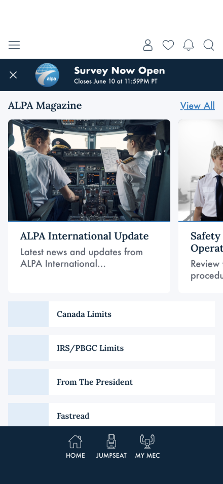
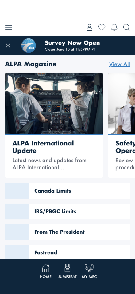
Implementation (AB#2358): --font-heading-family in alpa-components.css updated from the Lora stack to the Futura PT / Futura fallback chain (matching --font-body-family). Separately, --alpa-heading / --alpa-body were found to duplicate literal font stacks instead of referencing var(--font-heading-family) / var(--font-body-family) — meaning a MEC theme's Font/Heading / Font/Body override (injected via BlazorThemeService → alpa-theme.js → #mec-theme) never reached any component. Fixed to bridge through the semantic tokens, matching the existing --alpa-navy: var(--surface-brand) color-alias pattern. No physical Futura PT font files exist in the repo yet (base or MEC) — rendering currently relies on iOS's built-in system "Futura" via the CSS fallback chain until the licensed files are sourced and registered via @font-face (Blazor) / AddFont() (MAUI XAML).
MEC scope: Documented per-MEC brand fonts (UAL = LeagueSpartan, DAL heading = BebasNeue / body = LeagueSpartan, FDX = TBD per DQ-14) remain the design target and are unchanged by this decision — those come from decision D33. None of those files exist either, so every MEC theme (e.g. theme.UAL.json) renders the interim Futura PT value until its real brand font is delivered.
Verified live (2026-07-23): iOS simulator, /home-preview against live production data. Confirmed via getComputedStyle before and after, not just visual inspection — --font-heading-family moved from "Lora", Georgia, "Times New Roman", serif to "Futura PT", "Futura", -apple-system, "Segoe UI", Roboto, sans-serif, and --alpa-heading (what components actually consume) now resolves the same way, proving the token bridge works end to end.
DQ-9 — FlightCard scaffold ViewModel: base CardViewModel sufficient or needs FlightSegmentCardViewModel?
Resolved 2026-06-22
Decision: Option B — FlightSegmentCardViewModel : CardViewModel (recorded as D16 in the Decisions Record).
Field inventory vs CardViewModel:
| Required field | In CardViewModel? | Option A mapping |
|---|---|---|
Origin (IATA code) | No | Concatenate into Header or ContentText |
Destination (IATA code) | No | Same blob |
DepartureTime | No | Same blob |
ArrivalTime | No | Same blob |
Duration | No | Same blob |
FlightNumber | No | Same blob |
AircraftType | No | Same blob |
StatusBadge (text + color) | No | Cannot represent color in a plain string |
Why Option A fails the threshold: 8 fields must be independently rendered in discrete visual slots (origin/destination city codes, separate time row, leg detail strip, status badge). No fewer than 6–7 fields would have to be concatenated into ContentText — well above the 3–4 concatenation threshold. StatusBadge additionally requires a color value that has no representation in a string property. Type safety in the factory and clarity in the XAML bindings both require typed properties.
Answer: Option B adopted as D16. FlightSegmentCardViewModel : CardViewModel was initially the 10th scaffold component. Amended by D17: Flight Card demoted to Track B (typed domain component — FlightCardView : ContentView with 8 BindableProperty fields). The scaffold ViewModel is no longer used; direct property binding replaces the factory. Scaffold count: 10 → 9. Spec page: flight-segment-card-component.html (Track B display-data reference).
Updated specs: domain-controls, architecture, index, decisions record.
DQ-10 — flight detail flight info: new scaffold component or extend FlightSegmentCardViewModel?
Resolved 2026-06-22
What we found (2026-06-22 FTDT exploration): The Figma symbol flight detail flight info (node 4325:6399, 297×154 px) appears in two places — inside the expanded flight card-og detail panel, and on FTDT/Jumpseat detail pages. It shows a single flight leg from one direction (Departure OR Arrival), not the paired A→B route of the Flight Card.
| Field | FlightSegmentCardViewModel | flight detail flight info |
|---|---|---|
Origin | ✓ (e.g. "ORD") | ✓ (e.g. "DEN") |
Destination | ✓ (e.g. "SFO") | ✗ (not shown — one-directional) |
DepartureTime | ✓ | ✓ (e.g. "12:00") |
ArrivalTime | ✓ | ✗ |
Duration | ✓ ("4h 30m") | ✗ |
FlightNumber | ✓ | ✓ (e.g. "DL 302") |
AircraftType | ✓ ("Boeing 737") | ✓ (model number, e.g. "321") |
StatusBadge | ✓ ("ON TIME" / "DELAYED") | ✓ — richer: includes delay duration ("Delayed 34m") |
Gate | ✗ | ✓ (e.g. "Gate H14") — new field |
ActionLinks | ✗ | ✓ KCM / Jumpseat Policy — new field |
DirectionLabel | ✗ | ✓ "Departure" or "Arrival" — new field |
UpdatedTimestamp | ✗ | ✓ (e.g. "Updated April 21, 9:30am") — new field |
Ask for engineering / architecture
(1) Is flight detail flight info a new scaffold component (e.g. FlightLegInfoViewModel) with its own typed properties (Gate, ActionLinks, DirectionLabel, UpdatedTimestamp), or should it be a richer variant of FlightSegmentCardViewModel with optional additional fields? (2) Are Gate and ActionLinks (KCM, Jumpseat Policy) available from the existing Flight/Leg domain model or do they come from a separate API? (3) Is the delay duration in the StatusBadge derived from the same data as the Flight Card's status, or is it a separate field?
Initial assessment: The 4 unique fields (Gate, ActionLinks, DirectionLabel, UpdatedTimestamp) and the fundamentally different layout intent (single-directional leg detail vs paired-route card) suggest a new scaffold component. The overlap is 5 shared fields out of 12 total — below the reuse threshold established by DQ-9. However, the final call depends on whether Gate/ActionLinks come from the same data fetch as the flight card (which could push toward extension) or a separate detail API (which confirms a separate component and factory). See D15 precedent: one domain control, multiple Figma masters — the same could apply if it's one factory producing different scaffold types.
Design answer: Track B typed ContentView — FlightLegInfoView : ContentView with BindableProperty fields. The 4 unique fields (Gate, ActionLinks, DirectionLabel, UpdatedTimestamp) and the fundamentally different layout intent confirm this is not an extension of the flight card. Decided by D17 (two-track component pattern, 2026-06-22). See D17.
DQ-11 — Compact flight rows inside card-duty period-alt: separate FlightSegmentRowViewModel or embedded in the Duty Period template?
Resolved 2026-06-22
What we found (2026-06-22 FTDT exploration): When card-duty period-alt is expanded (Variant2, 345×1051 px), the "MANAGE FLIGHTS & DETAILS" panel contains inline flight segment rows. These rows show a 3-line format per segment:
- Date / time line (e.g. "April 28 2026 10:58 -06:00")
- Route line: Origin
→Destination with a plane icon (e.g. "DEN ——✈—— MIA") - Detail line: "Flight Time: 00:00 DL 302 757"
These instances are named flight detail flight info in Figma and are constrained to ~178 px wide by the duty period card container. Their layout is bidirectional (Origin AND Destination) — different from the standalone flight detail flight info symbol (DQ-10) which is one-directional. Fields visible: Origin, Destination, FlightNumber, AircraftType, FlightTime/Duration — 5 fields, no StatusBadge.
Ask for engineering / architecture
(1) Should the flight rows inside a duty period card be a reuse of FlightSegmentCardViewModel rendered in a compact/embedded variant (controlled by a ConstrainedWidth or Mode property), or should DutyPeriodCardViewModel own an inner collection with its own row template? (2) Does the Duty Period CRUD model (DutyPeriodExpanded) expose segment sub-entities with the needed fields (Origin, Destination, FlightNumber, AircraftType, FlightTime)?
Initial assessment: Two viable options — (A) DutyPeriodCardViewModel owns an IEnumerable<FlightSegmentSummary> collection of lightweight row objects (inline, no separate scaffold component); or (B) reuse FlightSegmentCardViewModel with a compact rendering mode. Option A is simpler and keeps the flight segment rows as internal detail of the duty period card. Option B enables shared XAML templates but requires adding a compact-mode discriminator to FlightSegmentCardViewModel. The 5-field, no-StatusBadge subset and the 178 px constrained width favor Option A (lightweight inline rows rather than a full scaffold component).
Why it matters: determines the implementation boundary of DutyPeriodCardView and whether sub-factories are needed.
Design answer: Option A — compact flight rows are internal to DutyPeriodCardView. The 5-field, no-StatusBadge subset and 178 px constrained width do not warrant a separate scaffold component. DutyPeriodCardView owns an inner collection (IEnumerable<FlightSegmentSummary> or equivalent lightweight row type) rendered via its own embedded template. No sub-factory needed. Decided by D17 (two-track component pattern, 2026-06-22). See D17.
DQ-13 — Loading / skeleton pattern for the dynamic feed: initial load and differential refresh UX
Tentative API approachContext: The dynamic feed loads a PageDto response. The app has a HomeSkeleton.razor / ComponentSkeleton.razor scaffold. The update strategy has been partially discussed but the skeleton UX has not been designed.
Agreed approach: client passes a since date; server returns the current PageDto (or the subset of containers updated since that date). Client compares the response against its cached state by id and resolves adds, removes, updates, and reorders itself. Server stays stateless — no diff computation, no client-state tracking required.
Flow:
| Scenario | Client behaviour | API call |
|---|---|---|
| First load / cold start | No cache — show skeleton, fetch full PageDto, render and store with fetch timestamp. |
GET /page/{pageId} |
| Return visit (unchanged) | Render from cache immediately; background refresh returns 304. | GET /page/{pageId}?since={lastFetched} → 304 |
| Return visit (content updated) | Render from cache; new payload arrives; client diffs by id — inserts added containers, removes missing ones, updates changed ones, reorders as needed. |
GET /page/{pageId}?since={lastFetched} → PageDto |
Ask for design
(1) Please provide Figma frames for the initial load skeleton (full-page, cold start). (2) Should in-place container updates (delta refresh) be visually silent, or should they animate in? (3) Do container skeletons vary by type (carousel skeleton vs grid skeleton vs stack skeleton), or is there one generic placeholder shape? (4) Is there a visual treatment for "content just updated" after a delta arrives (e.g. a brief flash or no visual signal)?
Engineering dependency (Option A): The backend needs to track a page-level or container-level last-modified timestamp so it can respond correctly to ?since= queries — returning only updated containers or a 304. The client already has id on every container and item (established in the API contract), which is the reconciliation key. No server-side diff computation required.
Design answer: — pending skeleton frames and animation decision —
Cross-reference: dynamic-feed-api-contract.html §9 Open Items (incremental page updates).
DQ-12 — Spacing tokens: inferred from auto-layout node hierarchy; 3 outlier values need design sign-off
Resolved 2026-06-30What we found: The Figma file (gpO3masyyNNHxjvRtdcRo7) has no spacing variables defined. The get_variable_defs call on the UAL home frame (node 20716:1802) returned empty. All spacing values in the current component spec are inferred or placeholder — none are sourced from Figma.
Figma references (base design — no spacing annotations yet): Home screen (node 4099:5230) · Carousel container (node 4317:5239) · card-lg (node 4033:1436) · card-md (node 4718:11125). These frames are the reference points for measuring spacing manually if variables cannot be added to the Figma file in time.
Why it matters: Spacing is a frontend concern — the frontend resolves it using its existing MEC context, so the backend does not need to carry it. But the frontend needs a canonical source of truth for the spacing scale and per-component usage before implementation. Without Figma annotations, any values baked into component styles will be guesses.
Ask for design
Please add spacing variable definitions and per-component annotations to the Figma file. Specifically needed:
- Spacing scale — define the token set with concrete pixel values (e.g.
Spacing/XSmall = 12px,Spacing/Small = 16px, etc.) as Figma variables so they can be read programmatically. - Container padding — annotate what spacing token applies to the internal padding of each container type: Carousel, Grid, Stack, ButtonGroup.
- Item gap — annotate the gap between items inside each container (horizontal gap in Carousel, grid gap in Grid, vertical gap in Stack).
- Section-to-section rhythm — annotate the vertical spacing between containers on the page.
Tentative answer (2026-06-26): Auto-layout inference sweep across 9 component nodes confirmed a strict 4 px grid. The scale below is implementation-ready for all components except Flight Card and Notification Card (3 outliers still need design confirmation). UAL MEC uses identical spacing — no MEC delta.
| Token | Value | Key usage |
|---|---|---|
Spacing/XTiny | 4 px | Button card body gap, inline icon gaps |
Spacing/Tiny | 8 px | Dominant step (14×) — card top padding, card-btn outer, navBar-bottom, carousel gap |
Spacing/XXSmall | 12 px | card-lg / card-md content item gap, button icon-text gap |
Spacing/Small | 16 px | Page margin (--page-margins), nav item py, card inner padding |
Spacing/Medium | 20 px | Notification card outer gap |
Spacing/Large | 24 px | card-lg bottom padding, notification outer padding |
Resolved (2026-06-30): The foundations reconciliation located the canonical Figma spacing scale (named 14-step scale, node 117:176 — xtiny 4 · tiny 8 · xxs 12 · xs 16 · small 20 · medium 24 · large 28 …), which supersedes this question's original "no spacing variables" premise. The 3 outliers are confirmed off that grid and are resolved by the consistency rule below; exact px confirmation rides on the reconciliation values pull (decision D-S1).
Consistency rule (adopted)
- Reusable components → normalize off-grid spacing onto the canonical scale: conform to the established convention for that control type; otherwise round up.
- Static / one-off controls → keep the value but note the exception in that control's own spec — don't force it onto the grid.
| Outlier | Lives in | Reusable? | Resolution |
|---|---|---|---|
| 5 px — notification text gap (4864:31875) | card-notification (Notifications + Comms) | Yes | Normalize → 4 px (Spacing/XTiny) |
| 10 px — flight-card section / route gaps (4555:7483, 4555:7000) | Flight Card (FTDT + Flight Finder) | Yes | Normalize → 12 px (Spacing/XXSmall) — conform to the card content-gap convention / round up |
| 18 px — bottom-nav inter-tab gap (5035:16370) | BottomNav (app chrome) | Yes (layout) | Flex-distributed — a computed result of even tab distribution (justify-content), not a spacing token. No 18 px token created; to be annotated in design-tokens' Spacing section under D-S1. |
Normalizations are decisions recorded here; the live token / CSS change is applied under D-S1 alignment (gated — must not shift shipped mock layouts). Full scale in design-tokens.html — Spacing & Layout Tokens. Cross-reference: dynamic-feed-api-contract.html §9 (spacing token strategy).
DQ-14 — MEC airline fonts: which weights are needed, and are separate files being procured?
Open — weight policy settled 2026-07-29; MEC font procurement (DAL, FDX) still blockingWhat we found: The Figma MEC screens use per-airline typefaces in addition to the base Futura PT. From the design captures so far:
- UAL — League Spartan throughout (headings and body, replacing Lora/Futura PT in branded sections)
- DAL — Bebas Neue (headings/section labels) + League Spartan (body/card text)
- FDX — font family not yet confirmed from design capture
Why it matters — bold requires a separate font file. Each font weight is a distinct binary file. The browser/rendering engine cannot generate a true bold from a single Regular file — it will apply synthetic bold (algorithmically thickened strokes) which looks noticeably worse, especially at display sizes. For a professional app this is not acceptable.
We currently have two purchased weights for Futura PT: FuturaPT-Book.otf (Book/400) and FuturaPT-Bold.otf (Bold/700), with matching .ttf files registered natively in MauiProgram.cs. In Futura PT, "Book" is the regular weight — the family has no separate face named "Regular", so Book and Regular are two names for the same 400 file, not two files. Weights between the two do not all resolve the same way: Medium (500) resolves to Book 400, while Demi/SemiBold (600) resolves to Bold 700 — CSS font matching rounds down below 500 and up at 600 and above. Both are real purchased faces, so neither is synthesised.
For the MEC airline fonts (League Spartan, Bebas Neue, etc.), we have no purchased files yet. Before implementation can begin on any MEC screen, the correct font files must be procured — one file per weight used in the design.
Ask for design
- Per MEC, which font weights does the design actually use? For each airline font (e.g. League Spartan UAL, Bebas Neue DAL) — list the exact weights: Regular, SemiBold, Bold, etc. Each distinct weight = one file to procure. If the design only uses one weight of a font, we need only one file; if it uses two, we need two.
- Can the design be constrained to two weights per font family? Regular (400) + Bold (700) is the most practical licensing target — it maps cleanly to
font-weight: 400andfont-weight: 700in CSS, with no intermediate weights that could fall back to the wrong file. If the design currently uses Medium or SemiBold, can those be rounded to Regular or Bold? - For Futura PT — does the design ever need weights other than Book and Bold? We have both purchased. Medium/SemiBold/Light would require additional licenses.
- FDX font family — please confirm which typeface(s) FedEx screens use (not confirmed from the current Figma capture).
Partial update (2026-06-26):
| Airline | Typeface(s) confirmed | Font files | Status |
|---|---|---|---|
| UAL | League Spartan (Regular 400 + Bold 700 per D33) | ual.alpa.org/Admin/File-Management → ALPA App > Branding > Fonts | Confirmed |
| DAL | Bebas Neue (headings/section labels) + League Spartan (body/card text) | Not yet located — pending design team delivery | Partial |
| FDX | Not yet confirmed from Figma capture | — | Open |
Questions 1–4 above still apply for each airline not yet at Confirmed. Full resolution is a procurement blocker for DAL and FDX implementation.
FDX re-checked 2026-07-06: the MEC Figma file was edited again on 2026-06-30, so the FDX page was re-scanned in full (every fill color and font on the page). Result: still no confirmed FDX typeface — the page shows a wide generic mix (League Spartan, Lora, Raleway, Futura PT, Futura, SF Pro, Merriweather, Inter) with nothing that reads as an intentional FDX choice, and zero FDX brand colors either. More Figma activity has not translated into FDX progress — this needs a direct design-team nudge, not another automated re-check.
Resolved 2026-07-29 — weight policy settled:
The base design system uses Regular/Book only. The Medium/Demi/Heavy Futura PT set previously assumed as forthcoming (see the tentative DQ-4 / DQ-8 note in naming-decisions-record.html) is not being procured. Design has accepted Regular/Book as the base text weight everywhere, which removes the licensing question for intermediate weights entirely.
The single exception is MEC customisation, which is a featured capability. A per-MEC theme may supply its own licensed typefaces and weights — that is the point of the MEC branding layer, and it is why the UAL League Spartan Regular 400 + Bold 700 pairing above remains valid. Those overrides ride on the MEC theme tokens (D33), not on base component rules.
Practical effect on the codebase: any base rule specifying an intermediate weight (500 / 600 / 800) has no real face of its own. .alpa-list-headline was corrected to font-weight: 400 under AB#2358. The remaining intermediate-weight declarations have not yet been swept — measured 2026-07-30: alpa-components.css 52 × 600, 16 × 500, 3 × 800; ftdt.css 36; widget.css 2 — 109 in total. Declarations at 400 and 700 are unaffected, since both files are purchased.
Correction (2026-07-30) — the sweep is not a visible change
This entry previously stated that intermediate weights "would render synthesised" and that the sweep "is a visible change wherever a real Bold face is currently being selected". Both are incorrect. Measured on device (iOS simulator, Blazor WebView) by rendering identical text at each weight in Futura PT and comparing widths:
| Requested weight | Rendered width | Face actually used |
|---|---|---|
| 300 · 400 · 500 | 516.960 px | Book 400 — a real face |
| 600 · 700 · 800 · 900 | 579.400 px | Bold 700 — a real face |
No synthesis occurs: CSS font matching selects a real purchased face in every case. Normalising 500→400 and 600/800→700 therefore selects the same face that is already being drawn — the sweep is visually null and does not require per-component design sign-off. It makes the stylesheet state what already renders. See Typography Font Mapping § 3.1.
League Spartan is not MEC-only (2026-07-30). This entry frames League Spartan as per-airline MEC branding (UAL). The 2026-07-30 census found Other/Button = League Spartan Regular 400 in the base design system of the working file owEYzHf7FrHRvWC2u82UOl — the button style for button pill, tab group, card-button, profile and the saved/recent searches card. No League Spartan file ships, so those buttons render Futura PT today. Under the two-file direction that is the correct outcome, but the base-level usage is a separate fact from the MEC branding layer. See Typography Font Mapping § 2.
Raised 2026-06-26. Weight policy resolved 2026-07-29. Related: D33 (font-family as MEC theme token — pending). Figma references: UAL home node 20716:1802 · DAL home node 21247:2989 · FDX home node 21010:2758.
DQ-15 — DAL: two distinct brand navies on the same screen — intentional primary/secondary pattern or inconsistency?
Open — confirm before speccing DAL theme tokensWhat we found: The DAL home screen (node 21247:2989) uses two distinct dark navies on the same screen:
- Welcome card background —
#002a50(Delta brand navy, the primary) - NAVIGATE grid (ButtonCard backgrounds) —
#09243d(noticeably darker, a different shade)
2026-07-06 update — pixel-confirmed via rendered screenshot (not just raw Figma fills), extends the pattern beyond the original two elements:
#002a50also appears on the Contract Comparison featured content card, not just the Welcome card.#09243d-family (sampled#0b2443, same shade within rendering tolerance) also appears on the TOOLS section cards (Scheduling Ticketing System, DART), not just the NAVIGATE grid.- The two tones repeating consistently across separate UI groupings (Welcome + featured-content vs. NAVIGATE + TOOLS quick-access cards) is stronger evidence for the "intentional primary/secondary pattern" hypothesis than a one-off inconsistency would produce — but this is still not a designer confirmation.
- New sub-finding: the bottom nav bar on this same screen samples as
#05273e— the base ALPA navy, neither DAL candidate. IfnavBar-bottomis meant to always trackSurface/Brand(the rule confirmed for UAL), this screen's nav bar doesn't yet reflect that for DAL — worth asking whether this mock is simply unfinished there, or whether DAL's nav bar intentionally stays unbranded. - Also sampled the confirmed heart/favorite-fill red on this screen:
#c01933— close to, but distinct from, ALPA's own base "red" (#c02126, used elsewhere in this doc suite) and from Delta's real-world corporate red (#e31837). Not yet confirmed whether this is a genuine DAL-specific accent or an unrelated near-shade.
Hypothesis: This may be an intentional primary/secondary brand surface pattern — e.g. Surface/Brand = #002a50 (primary, used for header/featured-content surfaces) and a second token (e.g. Surface/Brand-Dark or Surface/Brand-Secondary) = #09243d for quick-access/tool card surfaces. If so, this is a new token slot that doesn't exist in the current theme endpoint contract and needs to be added.
Alternatively it may be a draft inconsistency — the ButtonCard grid was painted with a slightly wrong navy and should be #002a50 to match the welcome card. The now-broader, more consistent pattern (extending to TOOLS and Contract Comparison) makes this less likely than originally thought, but doesn't rule it out.
We currently have no documented primary/secondary dark-brand surface pattern in the token set. The existing Surface/Alt token is light grey (#efefef) — an elevated card surface, not a secondary brand dark.
Ask for design
On the DAL home screen (node 21247:2989), #002a50 appears on the Welcome card and the Contract Comparison featured card, while #09243d appears on the NAVIGATE and TOOLS quick-access cards. Is this a real two-surface pattern?
- If intentional: please confirm the token name for the secondary shade (e.g.
Surface/Brand-Dark) so we can add it to the theme endpoint contract and spec it as a distinct override slot for DAL (and potentially other MECs). - If an error: please update the NAVIGATE/TOOLS card fills to
#002a50to match the welcome/featured-content surfaces. - New: should
navBar-bottomalso carry a DAL brand color on this screen? It currently renders as base ALPA navy (#05273e), not either DAL candidate. - New: is
#c01933(the heart/favorite fill on this screen) a genuine DAL-specific red, or just this mock's local choice? It doesn't match Delta's real corporate red (#e31837).
Design answer: — pending —
Raised 2026-06-26. Figma node: DAL home 21247:2989. Pixel-sampling pass 2026-07-06 (screenshot-confirmed, extends context). Blocks DAL theme token spec (D35 pending).
DQ-16 — Placeholder / fallback image assets: what should display when a remote image fails to load or is absent?
Open — needed before the ALPAMobile.Presentation asset-bundling passWhat we found: Several components accept a remote Image URL from the API at runtime:
- Hero Card (
CardHeroViewModel.Image) — 200 px tall editorial photo slot · Figma node 4033:1436 - Text Card / card-md (
CardTextViewModel.Image) — optional content image · Figma node 4718:11125 - Button Card (
ButtonViewModel.Image) — icon or thumbnail for feature buttons · Figma node 4737:13038 - Pilot / Member avatar (
PilotCard.AvatarUrl) — profile photo (currently falls back tofa-circle-user; confirm this is the intended fallback or provide a branded alternative) - Small Card (
CardSmallViewModel.Image) — compact content card image slot · node not yet confirmed from Figma capture
None of these have a defined fallback state in Figma. The Figma designs always show an image present.
We do not currently have bundled placeholder assets for any of these slots. The pilot avatar currently
falls back to fa-circle-user (icon-based), but the card image slots have no equivalent
treatment defined.
Why it matters: Without a fallback, a missing or slow-loading remote image leaves
a blank or broken image box visible to the user. This needs a design decision before the ALPAMobile.Presentation
is built — either a neutral branded placeholder graphic (e.g. a lightly-tinted ALPA mark or grey
rectangle with icon) or an icon-based treatment, per slot type. The assets (if graphical) must be
delivered via the SharePoint folder alongside other UI Refresh assets.
Ask for design
What should display in each image slot when the remote URL is missing or fails to load?
- Hero Card image area (200 px) — branded placeholder graphic, solid color fill from a Surface/* token, or a centered icon?
- Text / Small Card image — same treatment or slot hidden when absent?
- Button icon — FA icon fallback (which glyph?) or hide the icon slot?
- Pilot avatar — currently
fa-circle-user; confirm or provide a branded alternative.
If a graphical placeholder is chosen, please provide the SVG/PNG export in the SharePoint asset folder (see Asset Inventory → SharePoint Delivery Checklist).
Design answer: — pending —
Raised 2026-06-26. Affects Hero Card, Text Card, Small Card, Button Card, Pilot Card. Blocks the ALPAMobile.Presentation image-slot implementation.
DQ-17 — Icon strategy: interim Figma vectors in use; icon-font capability for the WebView still required (forward)
Open — interim vectors landed; icon-font path still openWhat we found (from the AB#1821 scaffold):
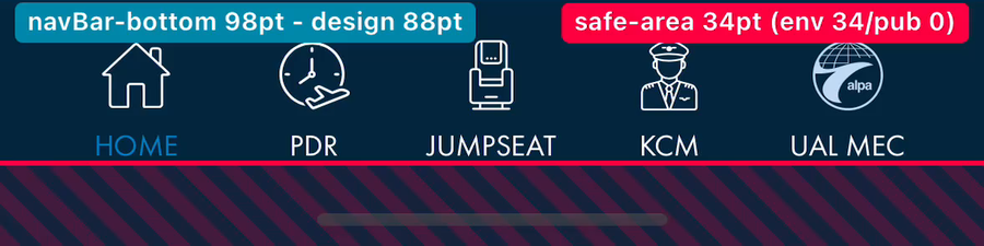
- The bottom-nav tab icons (HOME · JUMPSEAT · KCM · FTDT · MY MEC) are currently hand-drawn inline
<svg>paths repeated in every Razor page — not glyphs from the design's icon set. They are visual approximations and do not match the Figma icons. - The project's icon fonts —
materialdesignicons-webfont.ttfandfa-solid-900.ttf— live inResources/Fonts/for native MAUI (XAML) use only. The BlazorBlazorWebViewcannot see them: they are not copied towwwroot/fonts/and there is no@font-facedeclaration or<link>inwwwroot/index.htmlreferencing an icon font. - So the WebView/CSS has no icon-font surface at all — every icon in the Blazor UI is either an inline SVG path or a Unicode emoji (e.g. ♡ / 🔔 / ✕ on the saved-flight actions), which is why glyph weight and shape drift from the design.
Why it matters: the tab bar is on every screen, so an icon mismatch is the single most visible fidelity gap in the scaffold. It also blocks a clean implementation: hand-drawn SVGs cannot track the design system if the icon set is revised, and they make MEC theming of the tab bar (per-airline icon treatment) impractical.
Ask for design
- Which icon set does the design use for the bottom nav and in-app icons — Material Design Icons, Font Awesome, or a custom ALPA icon set?
- Delivery: provide either (a) the icon font file licensed for web/WebView use
(so we can wire one
@font-faceintowwwrootand reference glyphs by class), or (b) SVG exports of the canonical icon set. - Confirm the 5 tab-bar glyphs specifically: Home, Jumpseat (airplane seat), KCM, FTDT (clock), My MEC.
Proposed interim workaround: export the 5 tab-bar icon assets
(plus the high-frequency in-app icons) from Figma to wwwroot/images/icons/ as SVG/PNG
and reference them directly, replacing the hand-drawn paths — a temporary measure until the icon font is
confirmed and wired into the WebView. This unblocks visual accuracy without committing to a font-licensing
decision. (Tracked alongside the scaffold; see Asset Inventory.)
- Interim (current): the custom ALPA icon set is a bespoke Figma vector set
(~36 named symbols on page 🖤 Icons
3:7, not FontAwesome/Material). ~29 were exported as SVG and the BottomNav tab bar now references the real Figma vectors (PR #1664) — the hand-drawn approximations are being retired. We are "limping along" on these vectors for now. Catalogued in asset-inventory. - Forward requirement (still open): an icon-font capability for the
BlazorWebView is still needed to support scalable/extensible icon usage as the app grows (one
@font-face, glyph-by-class, MEC-themeable). The interim vectors do not retire this. Licensing + wiring remain to be decided — this is the open part of DQ-17.
3:7, section
"General Use Icons" 233:302) as the canonical icon family, delivered as
SVG exports to wwwroot/images/icons/ and rendered via the CSS
mask-image technique — MEC-themeable through background-color, so per-airline
icon tinting needs no additional assets. The icon-font @font-face track is
deferred, not abandoned — revisit when icon count or theming pressure demands it
(that forward capability stays on the books, but it should no longer gate implementation).
Licensing: none needed — these are ALPA-authored vectors. The bundled
fa-solid-900.ttf / materialdesignicons-webfont.ttf are
native-XAML-only and irrelevant to the WebView, so no web-font license question arises.
Design's sign-off here is a yes/no on the vector set as canonical; the interim wiring (PR #1664) already
matches the proposal.
Design answer (icon-font path): — pending —
Raised 2026-06-29 (AB#1821 scaffold accuracy pass); reframed 2026-06-29 to the dual interim-vector / forward-font strategy. Affects Page Template bottom nav and every screen. Related: DQ-4 (Futura PT weight gap — text fonts, distinct from icon fonts).
DQ-18 — Bottom-nav selected/active tab indicator: no design annotation for the selected state
Open — intent + base treatment captured (2026-06-30); active-state visual still a design gapWhat we found: The Page Template spec
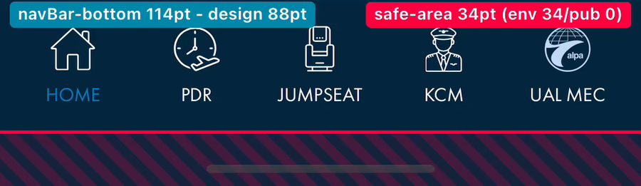
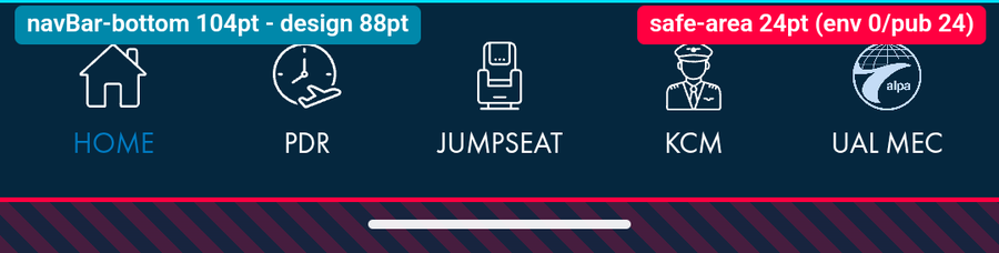
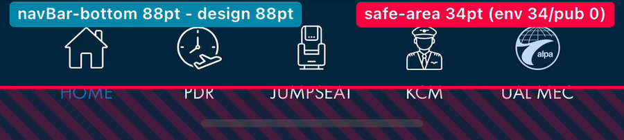
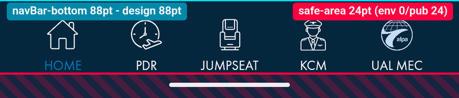
documents the navBar-bottom container (bg #05273e, px-16px,
pb-8px) and the five tab items, but there is no annotation in Figma for what the
selected/active tab looks like — no highlighted color, underline, pill, icon-fill, or
label-weight change is specified.
The reusable BottomNav component (built during the Option B chrome work, AB#2190) derives
the active tab from the current route and needs a defined selected state. The scaffold currently
improvises: the active item's label and icon switch to ALPA blue
(.alpa-nav-item--active → color/fill: var(--alpa-blue)) while inactive items stay
white. This is a placeholder, not a confirmed design.
Ask for design
What is the canonical selected-tab treatment for the bottom navigation?
- Color change (which token — ALPA blue, white-on-tint, accent?), and does it apply to icon, label, or both?
- Any additional affordance — top indicator bar, pill/background, filled vs. outline icon, label weight?
- Pressed / focus states (for keyboard + screen-reader accessibility, which Option B must wire by hand)?
Findings (2026-06-30, two sources):
- Design intent confirmed — the Teamwork mobile requirements (Bottom Tab Bar, Space 4173) state: "the active tab is visually highlighted to reflect the user's current section." An active treatment is intended.
- But the design artifact doesn't realize it — the canonical
navBar-bottom(FigmaKPK3kvOU1zPHWIovXPB6Wo, node4099:5232, Home screen) renders all five tabs identically: white labels (#ffffff) + light-blue icons (#c7dff6) on the navy (#05273e) bar — the Home tab is not differentiated (no highlight, indicator, pill, or opacity change). The active state is presumably aNavItem State=activevariant not applied in this static frame. - Base treatment ≠ scaffold — design base = white label + light-blue
#c7dff6icon; the scaffold improvises a dark-blue#007bc2active treatment, which is both the wrong base color and the lower-contrast choice (≈3.3:1 on navy — below AA for the label; less prominent than the white inactive tabs).
Sharpened ask: the requirement says "highlighted" but the design doesn't show how. Design to apply/specify the NavItem active variant — which token, on icon and/or label, plus any indicator (top bar / pill / fill). Whatever is chosen must be more prominent than the white inactive tabs and meet AA on navy. Two near-term fixes regardless: (1) move the scaffold base icon to light-blue #c7dff6 to match design; (2) replace the dark-blue active placeholder.
Evidence recap: the canonical navBar-bottom
(component 4038:1037, instance 4099:5232) draws all five tabs
identically — white 12 px Futura PT Medium labels, #c7dff6 28 px icons,
navy #05273e bar. The active-state variant exists in intent (Teamwork Space 4173:
"active tab visually highlighted") but is not drawn — this is a design-side gap.
Candidate on navy #05273e | Contrast | Verdict |
|---|---|---|
White #ffffff label (inactive base) | 15.37:1 | Pass (AAA) |
Light-blue #c7dff6 icon (inactive base) | 11.21:1 | Pass (1.4.11) |
Scaffold active #007bc2 label | 3.38:1 | FAILS WCAG 1.4.3 — the 12 px label needs 4.5:1; also less prominent than inactive white |
Yellow #f7bb0d | 8.83:1 | Pass |
Key fact: color alone cannot compliantly differentiate active
from inactive — white↔#c7dff6 is only 1.37:1, and no on-navy candidate
reaches 3:1 against white — so a shape affordance is required regardless of color.
Proposal: active = yellow #f7bb0d
(--alpa-yellow / Border/Yellow token) on the icon plus a
2–3 px top indicator bar; the label stays white. Inactive = white label +
#c7dff6 icon, per the design base above.
Scaffold implementation notes to fix when DQ-18 lands:
- The CSS rule
.alpa-nav-item--active .alpa-nav-icon { fill: … }is dead —filldoes nothing on amask-imagespan; the active icon actually stays white. - Scaffold inactive icons are white, but the design base is
#c7dff6— correct alongside the active-state change.
Design answer: — active-state visual still pending; intent + base treatment captured 2026-06-30 (Teamwork Space 4173 + Figma KPK3kvOU1zPHWIovXPB6Wo) —
Raised 2026-06-29 (BottomNav component, AB#2190). Affects Page Template bottom nav and the BottomNav component. Related: DQ-17 (tab-bar icon font).
DQ-19 — Render-surface + host strategy: selective native-XAML promotion & Blazor↔XAML navigation
Open — architecture / platformWhat we found:
- WebView-rendered Blazor may miss the native-feel bar on gesture/physics/transition-heavy interactions (swipe-to-delete, pull-to-refresh, drag-reorder, scroll inertia, native transitions); static content / forms / simple lists generally feel fine.
- Mixed mode is established as feasible — native XAML pages can host BlazorWebViews, so native + Blazor surfaces coexist in one app.
- The component library is render-surface-agnostic (D12/D17 two-track: ViewModel + variant model + tokens, not CSS-bound) — the same specs render as Blazor or native XAML without redesign.
- Ultimate fallback: because of that abstraction, the UI can pivot to full native XAML with no component redesign — the worst-case de-risk. The option space is a reversible spectrum: all-Blazor → mixed (XAML shell + native static, Blazor dynamic) → full native XAML, all from the same specs.
- The AB#2190 full-bleed spike proved the MAUI Shell constrains the BlazorWebView frame, so the host model materially affects how native and Blazor compose.
Why it matters: sets the host architecture and the native/Blazor surface split — but the chrome abstraction makes it low-regret: start mixed and escalate to full-native if testers reject the Blazor feel, without discarding the component work.
Current leaning (J. Castro — to validate with design + eng, not decided): XAML-first Shell + native static content, Blazor for the dynamic-UI portion (data-driven feed/widgets), with full native XAML held as the ultimate fallback.
To resolve
- Host model — XAML-first Shell (leaning) vs Blazor-first host; weigh the AB#2190 Shell-constrains-WebView finding.
- Surface split — confirm static = native / dynamic = Blazor; enumerate which screens land on each side.
- Switching between content (research) — back-stack, transitions, state preservation, theming parity moving native ↔ Blazor under the chosen host.
- Dual-track validation — prove the abstraction maps to a real XAML render (this is what makes the full-native fallback safe to rely on).
Design/eng answer: — pending —
Raised 2026-06-29. Related: D12 · D17 · AB#2190 (chrome/host + full-bleed) · AB#2191 (AppShell/MainLayout split) · AB#2087 (Presentation Extraction) · DQ-20.
DQ-20 — Saved Search/Flights action affordance: swipe-to-delete vs visible action column
Open — instance of DQ-19What we found: Figma renders saved rows with swipe-to-reveal delete (i-trash, native idiom); the scaffold uses a persistent visible action column (♥ save · ↻ re-search; 🔔 alerts · ✕ delete).
Why it matters: swipe fits a single destructive action and is costly to replicate in a WebView; these cards need multiple, mostly non-destructive actions, and accessibility needs a visible alternative regardless.
Leaning / baseline: visible action column as the default (multi-action + a11y + WebView fit); swipe-to-delete deferred as an optional enhancement for the destructive delete only — or moot if this surface is promoted to native XAML per DQ-19 (where swipe becomes free/idiomatic).
Design answer: — pending —
Raised 2026-06-29 (first concrete instance of DQ-19). Related: DQ-19 · Saved Search Card · Flight Segment Card.
DQ-21 — Type scale & accessibility text scaling across Blazor + native surfaces
Answered 2026-07-30 — implementation tracked on AB#2391Design answer (2026-07-30)
Yes — the app should honour the OS text-size setting. Design also confirmed Body/Body M (18px) is the page default, which had been the second half of the same ask.
The two answers interact: because text must scale, the base is declared in relative units rather than a fixed pixel value, so settling the default alone would have been rework.
Current state (audited 2026-07-30) — text cannot be enlarged at all. 320 font-size declarations are px with zero rem/em; text-size-adjust is unset; the viewport in index.html and home.html carries maximum-scale=1.0, user-scalable=no, so pinch-zoom is disabled too; and no base font size is declared anywhere, meaning unstyled text inherits the WebView's 16px. Together these fail WCAG 1.4.4 Resize Text, and user-scalable=no is itself a flagged anti-pattern.
Load-bearing constraint: iOS WKWebView does not apply Dynamic Type to web content automatically — converting to rem alone will not satisfy the answer. Either the font: -apple-system-body WebKit hook (iOS-only behaviour) or a native bridge that reads the OS scale and pushes it into the WebView is required. The bridge is recommended, since the app ships both iOS and Android heads. Scope, including the 90 fixed height declarations that are the 200%-reflow risk surface, is on AB#2391.
Full record: typography-font-mapping.html; the question as put to design is docs/requirements/design-question-typography.md.
What we found: the two render surfaces honour OS text scaling very differently:
- Native XAML (MAUI): nearly free —
Label.FontAutoScalingEnabledis on by default, so controls honour iOS Dynamic Type / Android font-scale automatically. - Blazor WebView: does not honour Dynamic Type at all — WKWebView renders CSS px and ignores the user's OS accessibility text size. The current scaffold (hard-coded px) therefore fails accessibility text scaling — a likely tester/compliance flag, and one more DQ-19 evidence point.
Why it matters: text scaling is a baseline accessibility requirement; the WebView gap means it must be engineered, not assumed. It also bears on the DQ-19 surface decision (another "free in native, manual in WebView").
Recommended approach (proposed):
- Relative, token-based type scale — named text styles →
rem/emanchored to a root size (extends the D33 Font/Heading · Font/Body tokens with a size scale); surface-agnostic; do first. - WebView scale-bridge — read
UITraitCollection.PreferredContentSizeCategory(iOS) /Configuration.FontScale(Android) natively, inject as a CSS variable (--text-scale) / root font-size, and re-apply on trait/config change (same pattern as the AB#2190 safe-area-on-rotation work). Clamp the multiplier so Larger Accessibility Sizes don't break layout. - Reflow, not just bigger text — text-bearing containers use
min-height, never fixedheight; explicit wrap-vs-truncate per component. (The 393×852 scaffold's fixed heights must become flexible — a component-spec + CLAUDE.md CSS rule.) - Native surfaces map the type tokens to scalable sizes (FontAutoScalingEnabled) and test.
- Test matrix: default · largest standard · Larger Accessibility Sizes, both platforms.
To resolve / decide
- Adopt the relative-type token scale + reflow rule now (cheap, surface-agnostic)?
- Confirm the WebView scale-bridge as the mechanism for Blazor surfaces (+ the clamp policy for accessibility sizes).
- Max-scale / reflow target — how far up must layouts survive (largest standard vs full accessibility range)?
Design/eng answer: — pending —
Raised 2026-06-29 (#6 accessibility pass). Related: D33 (font-family tokens) · design tokens · DQ-19 (render surface) · AB#2087.
DQ-22 — Content-item ID scheme (withdrawn)
Withdrawn — retracted premiseWithdrawn (2026-07-01): this question assumed a composite content-item id (ItemTypeId + prefixed ItemId, e.g. menu-123/doc-456/msg-789). That premise was retracted — the source table was erroneous. The real Content Contract has no composite key: content is a MenuItem (navigation) or a DocumentItem (content), served by the MobileContent API. No key-field / prefix-authority / namespace question remains.