Text Scaling Behaviour
imp/blazor-hybrid. Geometry figures are getBoundingClientRect readings taken on device, not estimates.Body/Body M (18px) is the page default. Both answers are recorded on DQ-21.
1 · Why scaling is non-linear
Scaling every size by the same factor destroys the type hierarchy and overruns fixed layouts. Android 14 solves this with a deliberately non-linear curve — small text scales aggressively (8sp exceeds 200 %) while large display text barely moves (57sp reaches only ~112 % at the 2.0× setting). The same shape is applied here.
Each type step carries its own damping coefficient, derived from three anchors (12px = 0.70, 18px = 0.45, 24px = 0.25) and interpolated between, rather than twelve hand-tuned values:
| Step | Damping | @ 1.5× | @ 2.0× | Growth |
|---|---|---|---|---|
| 12px (eyebrow, captions) | 0.70 | 16.2px | 20.4px | 1.70× |
| 14px | 0.617 | 18.2px | 22.6px | 1.62× |
| 18px (Body M — the page default) | 0.45 | 22.1px | 26.1px | 1.45× |
| 20px (Display S — card titles) | 0.383 | 23.8px | 27.7px | 1.38× |
| 24px (Display M) | 0.25 | 27.0px | 30.0px | 1.25× |
| ≥ 28px | 0.15 | — | — | 1.15× |
Hierarchy compresses but survives: the 12px : 24px ratio moves from 2.00 : 1 at default to 1.47 : 1 at 2.0×. Vertical budget: the 11–18px band — 84 % of the app's 284 type declarations — grows 45–72 %, not 100 %.
At scale 1.0 every step resolves to its original pixel value, so default rendering is unchanged.
2 · How the OS setting reaches the WebView
WKWebView, and Android's non-linear font scaling applies to native views only. Converting CSS to relative units alone would have had no effect — the scale has to be carried across explicitly.
ITextScaleService(Application port) — the head reads the OS preference and clamps it to 1.0–2.0.MauiTextScaleService— iOS derives the multiplier fromUIFontMetricsand observes the content-size-category notification, so changes apply without a restart; Android readsResources.Configuration.FontScale.Main.razor— the Blazor root publishes it once for every route.js/alpa-text-scale.js— sets--alpa-text-scaleon the root element, which every type step derives from.
Ceiling (decision D1). iOS accessibility sizes request more than 200 % — body reaches roughly 310 % at AX5. Those are clamped, not ignored: an AX user gets 200 % rendering rather than a broken layout. Supporting them fully needs genuine reflow (horizontal rows becoming vertical stacks), which is out of scope for AB#2391.
3 · Containers must grow, not clip
A fixed pixel height on a container holding text is WCAG failure F69 — enlarged text is "clipped, truncated, or obscured". All 90 fixed height declarations were classified; only the 10 text-bearing containers were converted to min-height. Icons, checkboxes, toggle knobs, tap targets, spacers and illustrations keep fixed geometry deliberately.
| Container | @ default | @ 2.0× |
|---|---|---|
.alpa-cardlg | 343px | 369px — grows |
.alpa-cardsm | 56px | 61px — grows |
.alpa-cardsm was already over-constrained at default scale: content needs 56px while height was pinned to 51px. Roughly 5px was being squeezed before any text scaling was involved.
Feed-track uniformity is unaffected — .alpa-feed-track is a flex row with the default align-items: stretch, so cards still match the tallest rather than going ragged.
4 · The tab bar — collision guard, not a scale threshold
The bottom nav is the tightest constraint in the app: five slots on a fixed-width bar, with labels that are white-space: nowrap and cannot break ("JUMPSEAT" is one word).
What actually broke
The original failure was not the text size — it was .alpa-nav-item { width: 53px }. At 2.0× the labels measured 57 / 87 / 41 / 32 / 74px against 53px slots, so "HOME" and "JUMPSEAT" ran together. Letting the slots flex (flex: 1 1 0 with a 53px floor) widened them to 67px and resolved the collision on its own.
Why the fallback is measured, not thresholded
An earlier attempt switched to icon-only above a fixed scale of 1.5×. Device measurement showed that to be wrong: at 2.0× the labels overflow their slots (JUMPSEAT by 20px) but land in neighbouring slack and do not collide. A scale-based switch would therefore have discarded perfectly readable labels — the opposite of what a user asking for larger text wants.
UserInfo.MEC via IMecContext — so its width varies by airline, and slot width varies by device.
Accessibility is unaffected by the visual label being dropped: every slot keeps its aria-label.
5 · Device evidence
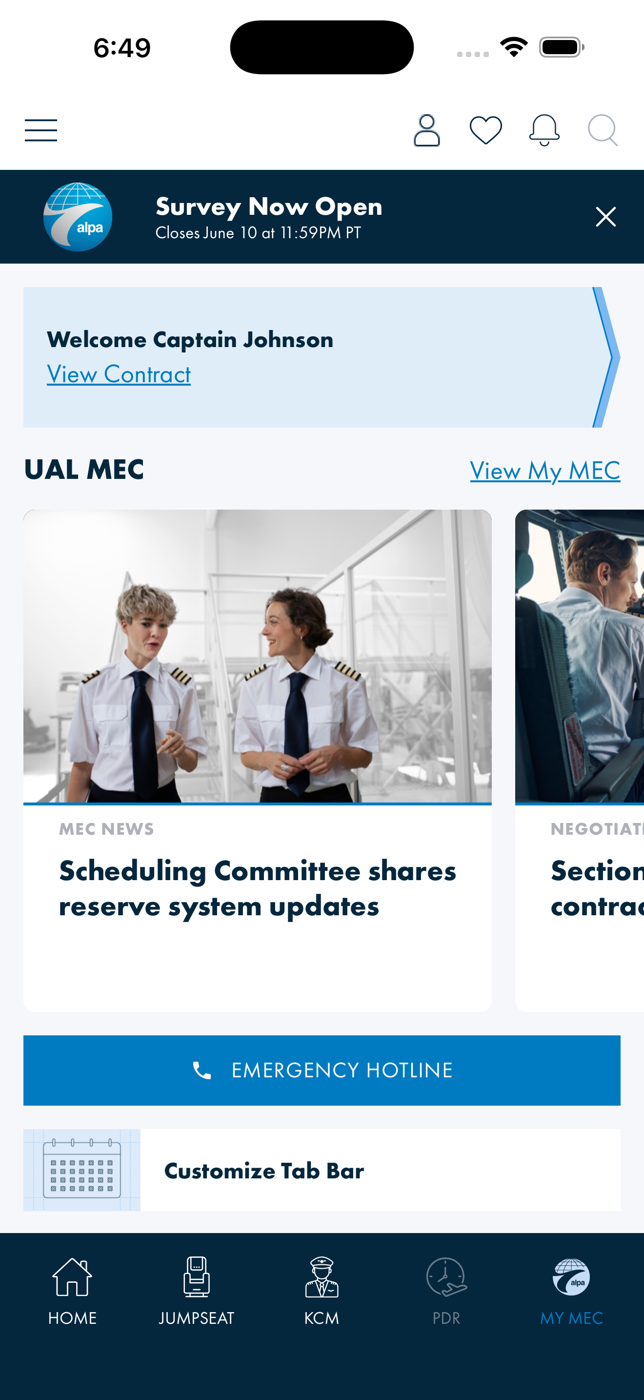
Band
standard. Labels 12px. Identical to pre-change rendering.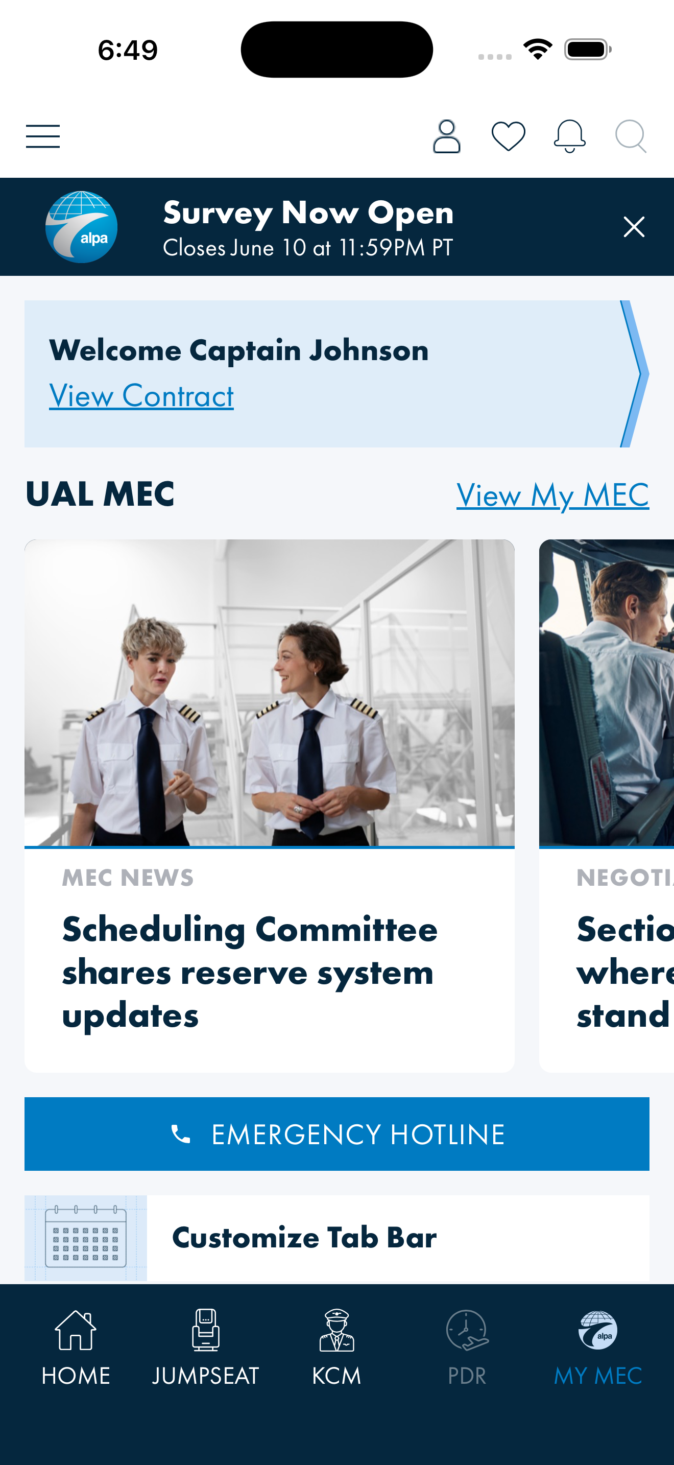
Band
standard. Labels 16.2px, body 22.1px. Cards absorb the growth.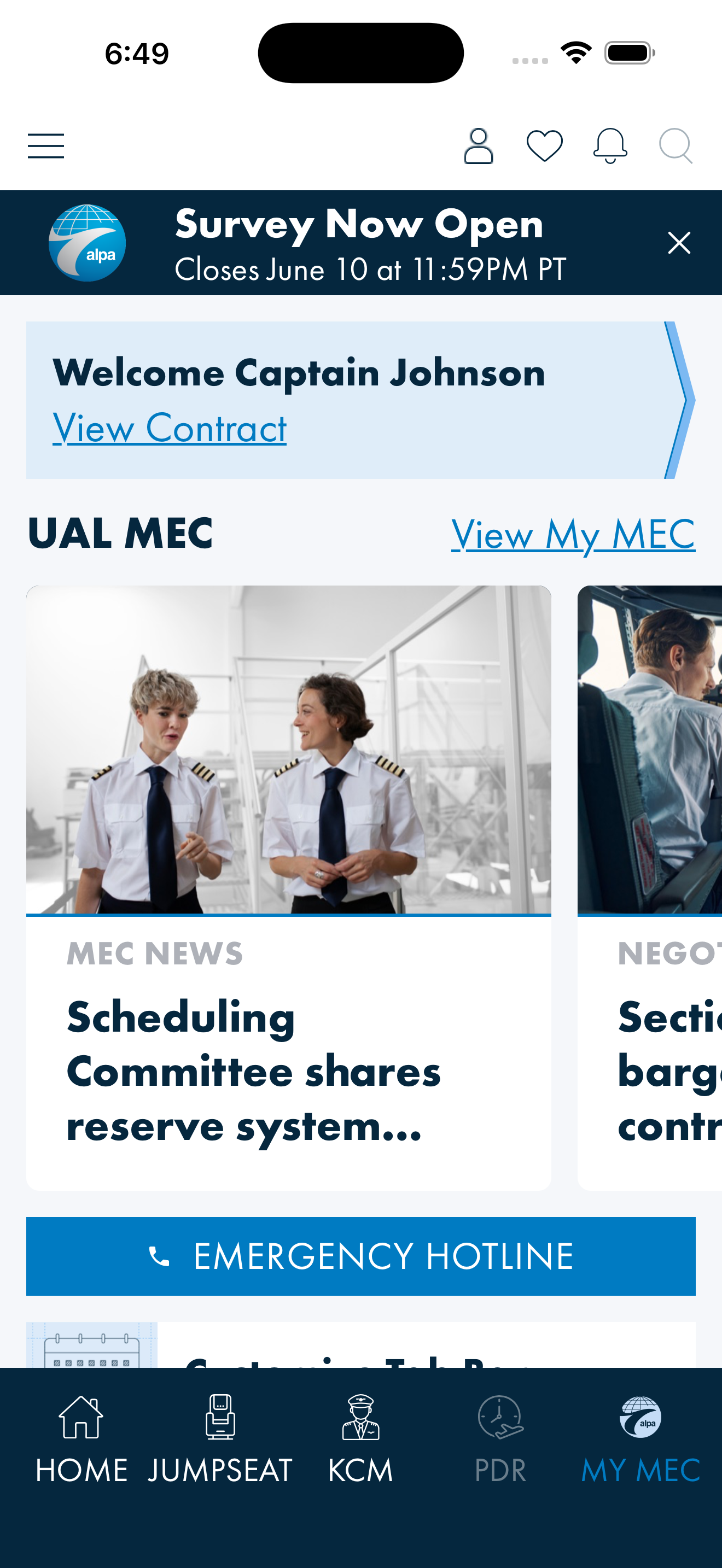
Band
standard. Labels 20.4px and still legible; no collision, so the fallback stays out of the way.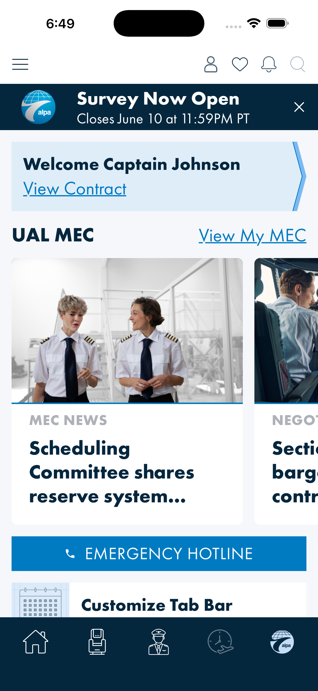
Long dynamic MEC label ("CONTINENTAL MEC") collides, so band flips to
large: labels drop, icon grows to 36px.| Case | Band | Labels | Icon |
|---|---|---|---|
| Normal labels @ 2.0× | standard | visible, 20.4px | 28px |
| Long MEC label @ 2.0× | large | hidden | 36px |
6 · Known limits
- iOS accessibility sizes (AX1–AX5) are clamped to 200 %, not supported natively. Documented, not silent.
- Card titles truncate at high scale rather than growing the card indefinitely — visible in the 200 % evidence above. Acceptable for titles; would not be for body content.
- Damping coefficients are a proposal shaped to Android's published behaviour, not derived from user testing. Worth a review pass against real screens.
- Android live changes have no equivalent of the iOS notification;
Refresh()exists for the head to call on resume.
Related: Typography Font Mapping (the two-file mapping and type census) · DQ-21 · AB#2391.