KCM + Airline Policies — Spec & Reconciliation
The seven Figma screens covering KCM and Airline Policies, specified from the working Figma file and reconciled against the current Blazor implementation. Divergences are logged as numbered findings; fixes are separate work items.
grep for "filter" matched the identifier FilteredAirlines. Class surfaces
and service injection are not evidence of behaviour.
A fifth was found wrong after publication. KCM-7 reported the Airline Policies detail as unbuilt behind a dead route; it had shipped eleven days earlier. That claim was inherited from FF-2 in a sibling audit rather than checked here — the one thing this note said was always safe to verify, route existence, was the thing taken on trust from another document. Corrected in place below, and in flight-finder-audit.html at source. A finding copied from another document is not a verified finding.
1 · Screen inventory
| Figma node | Screen | Route | Verdict |
|---|---|---|---|
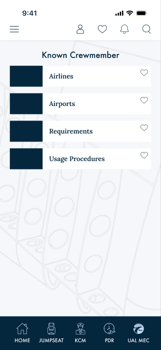
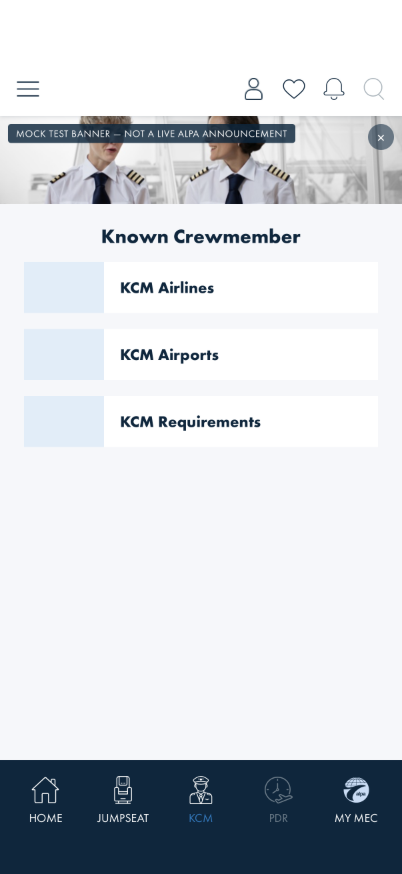
4562:7572 | KCM home | /kcm |
DIVERGES KCM-1 |
4562:7754 | KCM-Airlines | /kcm/airlines |
DIVERGES KCM-2, KCM-3, KCM-4 |
4562:8545 | overlay-kcm filter | — none — | NOT BUILT KCM-5 |
4562:8249 | KCM-Airports (list) | — none — | NOT BUILT KCM-6 |
4562:7954 | Airline Policies — search state | /kcm/policies |
PURGED 2026-08-13 — the screen had no backing data source and no
legacy-XAML counterpart; the search need is served by /jumpseat/airline-policies's
title-bar search state (4713:25303). |
4713:25321 | Airline Policies — default state | /jumpseat/airline-policies |
DIVERGES KCM-7 |
4713:25339 | Airline Policies — detail | /jumpseat/airline-policy |
DIVERGES KCM-7 |
| — no node — | KCM airport detail | /kcm/airport/{Code} |
NO DESIGN KCM-8 |
Figma reference renders
4562:7572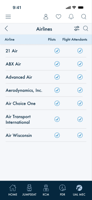
4562:7754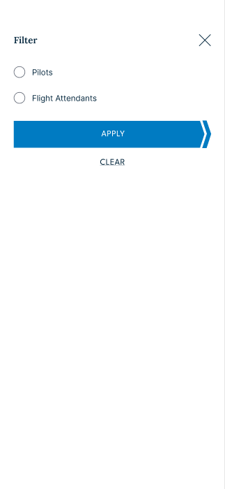
4562:8545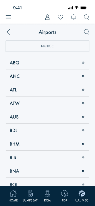
4562:8249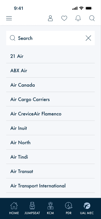
4562:7954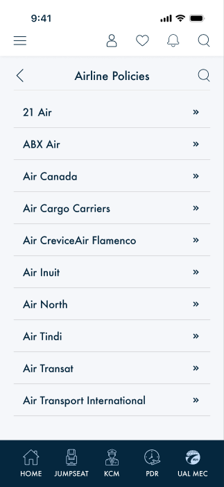
4713:25321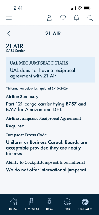
4713:25339/kcm/policies and /jumpseat/airline-policies
look alike and share the alpa-jsff-* form classes and the JumpseatQueriesRouter
gateway, but they are different screens. KCM's is a search form (airline
select + airport field + submit) over KCMAirlineItem, badging jumpseat eligibility by
crew role. Jumpseat's is a browse list with type-ahead over PolicyViewModel,
badging carrier affiliation (ALPA / CASS). Different data, different facts, different
destinations. A shared gateway is not evidence of shared purpose.Superseded 2026-08-13 —
/kcm/policies was purged: the "different data"
above never materialized (no backing data source), and the legacy XAML app has no such screen. The one
airline-policy search surface is /jumpseat/airline-policies.
Built — what shipped
2 · Data model — the crew-role list
The Airlines screen's two columns are an independently maintained list of carriers that support jumpseating by employee role. That is modelled and available:
| Model | Fields | Used by |
|---|---|---|
KCMAirlineItem |
airlineName · pilots (bool) · attendants (bool) |
KCM Airlines, KCM Policies search |
JumpseatAirlineItem |
AirlineName · IsALPACarrier · IsCASSCarrier · Policy · Website |
Jumpseat Airline Policies |
These are different lists carrying different facts and must not be conflated —
ALPA/CASS is carrier affiliation, pilots/attendants is jumpseat eligibility
by crew role. Source today is MockKcmApiService, pending the live endpoint; eligibility
semantics are recorded in kcm-screen-data-gap.html.
3 · Design tokens the screens use
| Token | Value | Used by |
|---|---|---|
Page Margins / Page Columns | 16 / 8 | all KCM screens |
bg-no-img / bg-03 | #F5F7FA | page background |
Surface/Subtle | #dfedf9 | Airlines rows, Policies detail |
Border/Default · Border/Subtle | #d2d4d6 · #e3e3e3 | form fields · separators |
Border Radius/S | 0 | form fields — square, not rounded |
Drop-subtle | drop shadow #0000001A, radius 7 | Airlines rows |
Buttons and Form Fields | padding 16/16, icon-text gap 12 | all form fields |
UI/form-text labels · UI/Primary | #5d6471 · #007bc2 | filter overlay · Airlines |
4 · Type-style census addendum CORRECTS A MERGED DOC
| Type style | Family | Style | Size | Line height | Found on |
|---|---|---|---|---|---|
Display/XS | Lora | SemiBold 600 | 16 | 1.2 | KCM home, filter overlay, Policies detail |
UI/forms/input text | Futura | Medium 500 | 18 | 1.0 | Airlines, Airports, Policies search |
Other/Form Field | Inter | Regular 400 | 14 | 1.5 | filter overlay |
At least 11 type styles, not 8. All three map onto the two licensed Futura PT files by the existing rule (≤ 500 → Book 400, ≥ 600 → Bold 700), so no mapping change is required — only the count.
Other/Form Field and Other/Caption separate.
They carry identical values today (Inter Regular 14px, lh 1.5) under distinct family and weight
tokens. Two variables cost almost nothing; merging them destroys information, so a later decision to
restyle form fields would silently move every caption too. Distinct roles that happen to share values
are cheap insurance. Extending for new design styles is likewise cheap: our scale steps are keyed by
size, not role, so a new style at an existing size needs no new variable at all.
--font-title-lg-size (28px) is a scaffold artifact, not a missing design style.
The Display ramp found in Figma is XS 16 / S 20 / M 24 — no 28. Tracing the three unaccounted sizes in
our stylesheet: 28px is used by exactly one rule (.alpa-kcm-hero-status), 36px by one
(.alpa-kcm-hero-iata), and 48px by an icon glyph. The first two belong to the bespoke KCM
hero that Figma does not specify (KCM-1), so both should retire with that component. Confirmed 2026-07-31: this is a scaffold artifact, not a missing
design style — no design input required.
5 · Findings
KCM-1 — Home is a mock, not the specified layout DIVERGES
Figma 4562:7572 specifies the title "Known Crewmember" over four
card-sm rows (51px each). KcmHomePage.razor renders something else
entirely:
- A hero status card with hardcoded mock content —
KCM STATUS/ACTIVE/"United Airlines · Employee #482910". A fabricated employee number and a status that is never computed. - Three quick-action tiles using emoji as icons (🏢 ✈ 🔍) while the app has a mask-based icon system.
- A "Recent airports" list using
.alpa-policy-row.
None of this is in the design, and the hardcoded status is the most pressing part — it presents fabricated eligibility as fact.
card-sm rows to draw in place of a hero and
some tiles. Reading the legacy XAML on 2026-07-31 showed the rows are not a fixed list at
all. KCMHomePageViewModel builds them from the KCM
MenuItem's children — rendering each only when Visible, navigating only
when Enabled — and then appends Usage Procedures from its own separate
MenuItem only when that is Enabled.
Building the four cards the mock happens to show would have looked correct and behaved wrong: the CMS could no longer hide or disable an item, which is the entire purpose of those flags. A Figma frame shows one state of a data-driven screen; it cannot show the conditions that produce it. This is the second time in this document that reading a design without reading the shipped implementation produced a wrong finding — see the KCM-7 correction.
Two further gaps the finding did not mention, both found only by running it:
- The CMS paths are native Shell routes, not Blazor routes — live values are
KCMAirlinesPage,KCMAirportsPageandWebViewPage?SourceString=https://www.tsa.gov/…. Rendered into an anchor unchanged they resolve as relative Blazor routes and navigate nowhere, so the Blazor page has to map them. - The background watermark has no web-servable asset. The design and the XAML
both show the KCM mark behind the content (
img_kcm_white.pngat 0.2 opacity in XAML), but that file exists only under nativeResources/Images— there is no copy inwwwroot. The page background colour itself is already correct (--alpa-page#f5f7fa matches the frame).
4562:7572: title over a
card-sm stack at the design's 16px gap (cards at y 0/67/134/201 against a 51px row), on
the existing page background. Visible and Enabled are both honoured, and an
unmapped destination is presented as unavailable rather than linked into a dead end. The hero, the
emoji tiles and the invented "Recent airports" list are gone.
Remaining: Usage Procedures renders without a link — it opens a bundled PDF through a platform-specific pdf.js path in a native WebView, which has no Blazor host yet. The watermark asset is still unavailable to the web layer. Both are recorded above rather than papered over.
KCM-2 — jsff is a misnomer for a shared form subsystem NAMING
KCM's screens are built from .alpa-jsff-* classes. That prefix reads as Jumpseat Flight
Finder private, but the subsystem is used by six pages — Jumpseat search and policies,
both KCM screens, MEC hotels and global Search. It is a de-facto shared form system, so the reuse is
legitimate; the name misleads and invites exactly the cross-subsystem-borrowing suspicion this
audit initially raised. Worth renaming to a neutral form prefix.
KCM-3 — Airlines presents eligibility as pills, not the specified columns DIVERGES
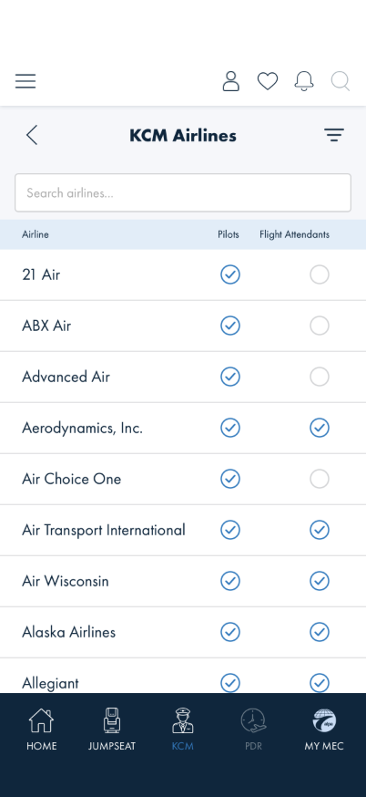
Figma 4562:7754 specifies a table: a persistent header row —
Airline · Pilots · Flight Attendants — with each row carrying two check-mark
columns. The 188px head frame is taller than the standard template to accommodate it.
The implementation renders the same information as StatusBadge pills shown only when true, stacked under the airline name, with no header. The data is correct and present; the presentation differs in a way that matters:
4562:7754 — persistent header, two check-mark columns.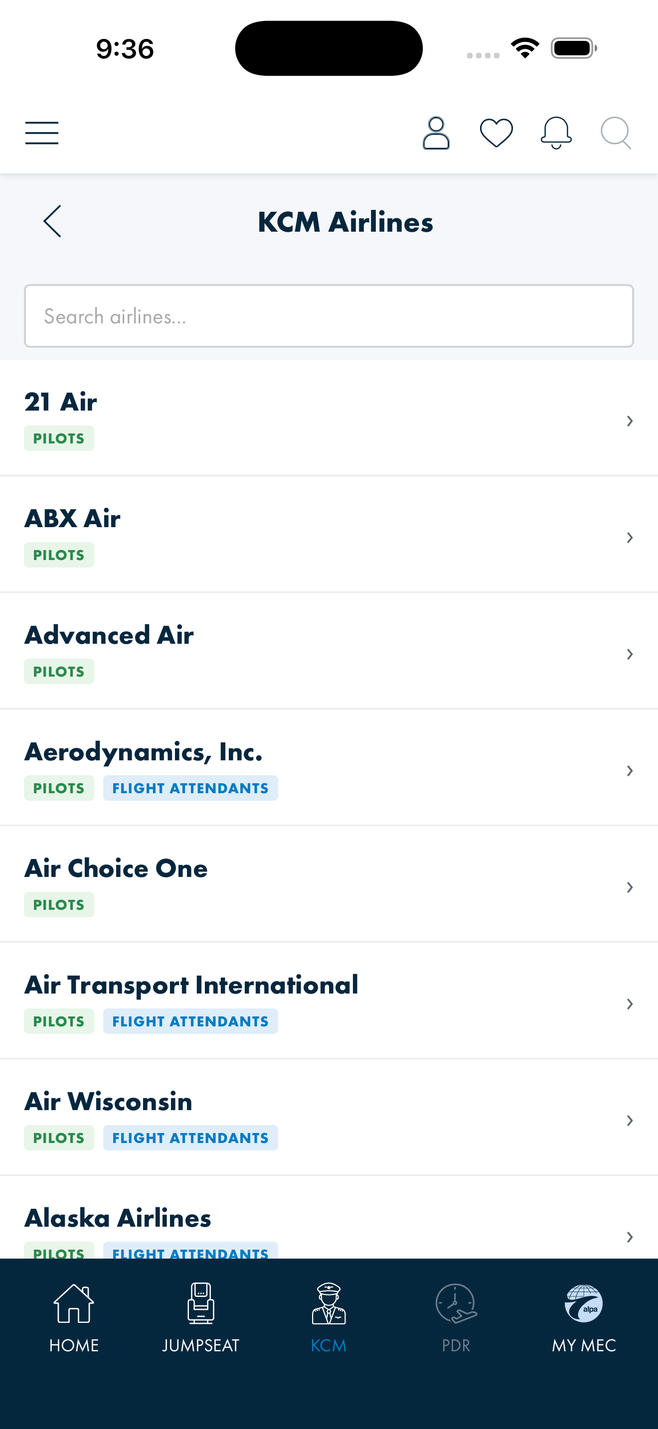
- A fixed column grid lets a user scan vertically to compare carriers. Pills do not align, so comparison is impossible.
- Absence reads as "no badge" rather than an explicit unchecked mark — ambiguous between "not eligible" and "unknown".
The legacy XAML (KCMAirlinesPage.xaml) does implement the header and columns, binding
pilots and attendants to check-mark visibility. It is the closer reference.
The rebuild must not regress the CSS alignment work already merged. The screen currently inherits the typography and scaling corrections from AB#2358 and AB#2391 — the licensed two-file font mapping,
min-height containers so rows grow rather than clip
(WCAG F69), and the --fs-* non-linear text-scale steps. A grid built with fixed row
heights or hard-coded pixel type would undo all three. Build the columns with
min-height rows and the existing scale steps, and the check-mark glyphs as fixed
geometry (they are icons, not text, so they legitimately do not scale).
4562:7754 (row order matches the design's sample). New
alpa-kcmal-* prefix, verified unused so no later selector can silently override it.
Constraints held: min-height rows, --fs-* type steps, check glyph fixed
at 22px.
GAP-A — the design has no unchecked state, and it is load-bearing. The Check Indicator atom
4562:8918 is a single symbol with no variant set, and the page
mock shows every row fully ticked — so false is never drawn. Live data has it
constantly: 125 eligible / 27 not. Rendering nothing for false would
reproduce the very ambiguity this rebuild exists to remove, so absence is stated explicitly — same
22px circle, tick omitted, muted, with an aria-label of "not eligible" so assistive
tech states the value rather than inferring it from a missing element. Our reading, not
design intent; an explicit ×, or a third "unknown" state, are equally reasonable. Raised
for design in new-components-2026-06-10.html.
Retired an unlogged defect. The old markup wrapped every row in
<a href="/kcm/airport"> — an airport route, with no Code
parameter, reached from an airline list — so every airline opened the same parameterless
airport detail. The design has no chevron and no drill-in, so rows are no longer links at all.
Still divergent: Figma puts search and a filter icon in the nav bar; the inline search input remains for now. That is nav-affordance work and lands with KCM-5, whose entry point is that filter icon.
KCM-4 — StatusBadgeKind.Cass mislabels flight attendants BUG
Both KCM screens badge crew-role eligibility with:
Label = "PILOTS", Kind = StatusBadgeKind.Kcm and
Label = "FLIGHT ATTENDANTS", Kind = StatusBadgeKind.Cass
CASS is the Cockpit Access Security System — it governs cockpit access for pilots and has
nothing to do with flight attendants. The Jumpseat policies page uses the same
Kind = Cass to badge an actual CASS carrier, so two screens style semantically unrelated
facts identically. The enum value is being used as a colour token rather than a meaning.
Cass went with
them, so no new enum value was introduced for a component the design deletes.
The
ALPA / CASS badges on JumpseatAirlinePoliciesPage are
deliberately left in place: those are carrier type, where Kind = Cass is the
correct meaning. Note they are still a divergence from 4713:25321, which shows no
badges — carrier type already appears on the detail screen. Open, pending a call.
KCM-5 — Filter overlay not built NOT BUILT
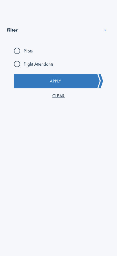
Figma 4562:8545 reuses the flight finder filter and sort component (357px):
two radio buttons, a primary button and an underline Clear, with the tab group hidden. No KCM page
contains any filter or sort UI. Its two radio options are presumably the crew-type split, which the
current pill presentation could not express as a filter anyway.
KCM-6 — Airports list not built NOT BUILT
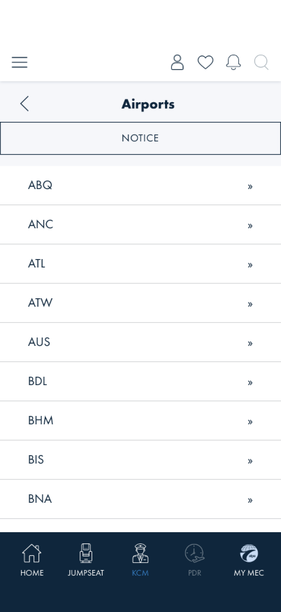
Figma 4562:8249 specifies a Secondary button above a list of 10 form-field rows (56px),
with back + search in the nav. No /kcm/airports route exists —
/kcm/airport/{Code} is the detail page. Legacy XAML exists at
ALPAMobile/Pages/KCMAirportsPage.xaml and should be consulted for behaviour.
KCMAirportItem carries airportName, airportCode,
checkinNotes, mapUrl and no crew-role booleans.
KCMAirlineItem is the only model with pilots/attendants, so a
check-column table here would have nothing to check — and the mock 4562:8249 is a plain
drill-in list anyway. Build it as a list. The erroneous note is corrected at source; no design input
needed.
JumpseatAirlinePolicyPage.xaml were rendering
incorrectly when this document was written: the Track B FormFieldListRowView migration
dropped the <Border> that supplied each row's white card, so rows sat directly on
BannerPage's blue gradient, and TrailingText was set to »
(a double angle quote) instead of a single chevron. Fixed under
AB#2397 — the pages now render white rounded cards with 15pt gaps and one chevron,
matching what ships on DotNet10.
That fix restores parity only. The Figma design above still governs the rebuild: a continuous full-bleed sheet with hairline separators and NOTICE as a button rather than a list row. Do not read the corrected XAML as the target presentation.
KCM-7 — Airline Policies detail renders one CMS body where the design specifies four labelled fields DIVERGES
JumpseatAirlinePolicyDetailPage.razor exists at
@@page "/jumpseat/airline-policy", the list's
/jumpseat/airline-policy?airline=… link resolves to it, and it was built on
2026-07-18/20 under AB#2301 (7654d893, c25d0d01,
dd9f3f1a) — eleven days before this document was written, with all three commits
ancestors of the tip it claims to audit.
The claim was inherited from FF-2 rather than verified independently. FF-2 in flight-finder-audit.html carries the same stale assertion and is corrected in the same pass. This is the failure mode the Method note at the top of this document warns about, repeated — a route's existence is cheap to check and was not checked.
Figma 4713:25339 specifies a heading ("21 AIR" over "CASS Carrier"), an
MEC-scoped callout ("UAL MEC JUMPSEAT DETAILS / UAL does not have a reciprocal
agreement with 21 Air"), an "*Information below last updated 2/10/2026" freshness line, and then
four discrete labelled fields — Airline Summary, Airline Jumpseat
Reciprocal Agreement, Jumpseat Dress Code, Ability to Cockpit Jumpseat
International — each a small label above its value.
What is built. The page renders the name heading, the ALPA/CASS carrier line, the
MEC callout (with credentials, MEC links and sign-in gating), the CMS body, and a feedback line. The
MEC callout already resolves the viewer's MEC rather than using a static string, and treats the
"---" MecId sentinel as GENERAL.
The real divergence is the body, and it is a data-shape gap — not a UI gap.
PolicyViewModel carries a single Description holding CMS HTML, rendered as one
block via SanitizeCmsHtml. It has no field for any of the four labelled
values and no last-updated field. Rendering the specified structure therefore cannot be
done in the component alone; it needs either four typed fields plus a timestamp from the source, or
parsing of the CMS HTML — and parsing prose into structure is brittle enough to be a poor trade.
4713:25339, the policy payload needs AirlineSummary,
ReciprocalAgreement, DressCode and InternationalCockpitJumpseat
as discrete values, plus a LastUpdated date for the freshness line. Until then the single
CMS body is the only faithful rendering of the data that exists. Raise with the backend team alongside
the other data-shape asks rather than absorbing it as UI work.
The legacy list page for this screen, JumpseatAirlinePolicyPage.xaml, carried the same
rendering regression described under KCM-6 and is fixed under AB#2397.
It matters less here than for Airports, since this screen does have Figma coverage
(4713:25321 / 4713:25339) — the design, not the legacy page, is the
reference.
KCM-8 — Airport detail exists with no design NO DESIGN
/kcm/airport/{Code} (KcmAirportDetailPage.razor) is implemented but has
no Figma node — the inverse of the usual gap. It also uses two prefixes
(.alpa-kcm-* and .alpa-kcmad-*), so its styling is not cleanly owned.
Implemented 2026-08-13 — the XAML-parity alignment proposed below is now the shipped
Blazor page: airport name · inline cached map (IMapCacheService, cache hit inlined as a
data: URI for the WebView) with loading/offline states and a full-screen viewer · check-in
notes · advisory, all on app tokens. The scaffold's IATA hero and the per-airport KCM AIRLINES reference
list are gone, and with them the .alpa-kcmad-* prefix. The screen still has no Figma node —
the design-status question for the team below stands.
ALPAMobile/Pages/KCMAirportDetailsPage.xaml), which is the shipped behaviour this screen
replaces. Offered as our sensible alignment for the design team to accept, amend or replace — not as
an assertion of design intent.
| Region | Content | Proposed treatment |
|---|---|---|
| Heading | Full airport name | Display/XS (Lora SemiBold 16) — matches the other KCM headings |
| Map | Schematic terminal diagram with KCM checkpoint pins, tappable to full screen | Full-bleed within page margins; "Tap to view full screen" hint below |
| Map — full screen | Same diagram enlarged, plus an unlabelled floating action button | Undesigned second view — needs a designed affordance for the FAB, or its removal |
| Map — offline | Icon + "Map unavailable offline" + "Connect to WiFi to download and cache this map for offline use" | Same treatment as the Off the Radar empty state, on bg-no-img #F5F7FA |
| Check-in notes | checkinNotes — multi-paragraph, one entry per checkpoint with hours and station count | Body/Body M (18) with paragraph spacing between entries |
| Notice | Advisory text, conditional | Body/Body S (12), secondary colour |
The screen is two views, not one — the detail and the full-screen map it opens. Both are captured in §6.
6 · For the design team
The airport detail screen has no design
/kcm/airport/{Code} is live in the app but has no Figma node — it was
carried over from the legacy app without a design pass. It is the only KCM screen in that position.
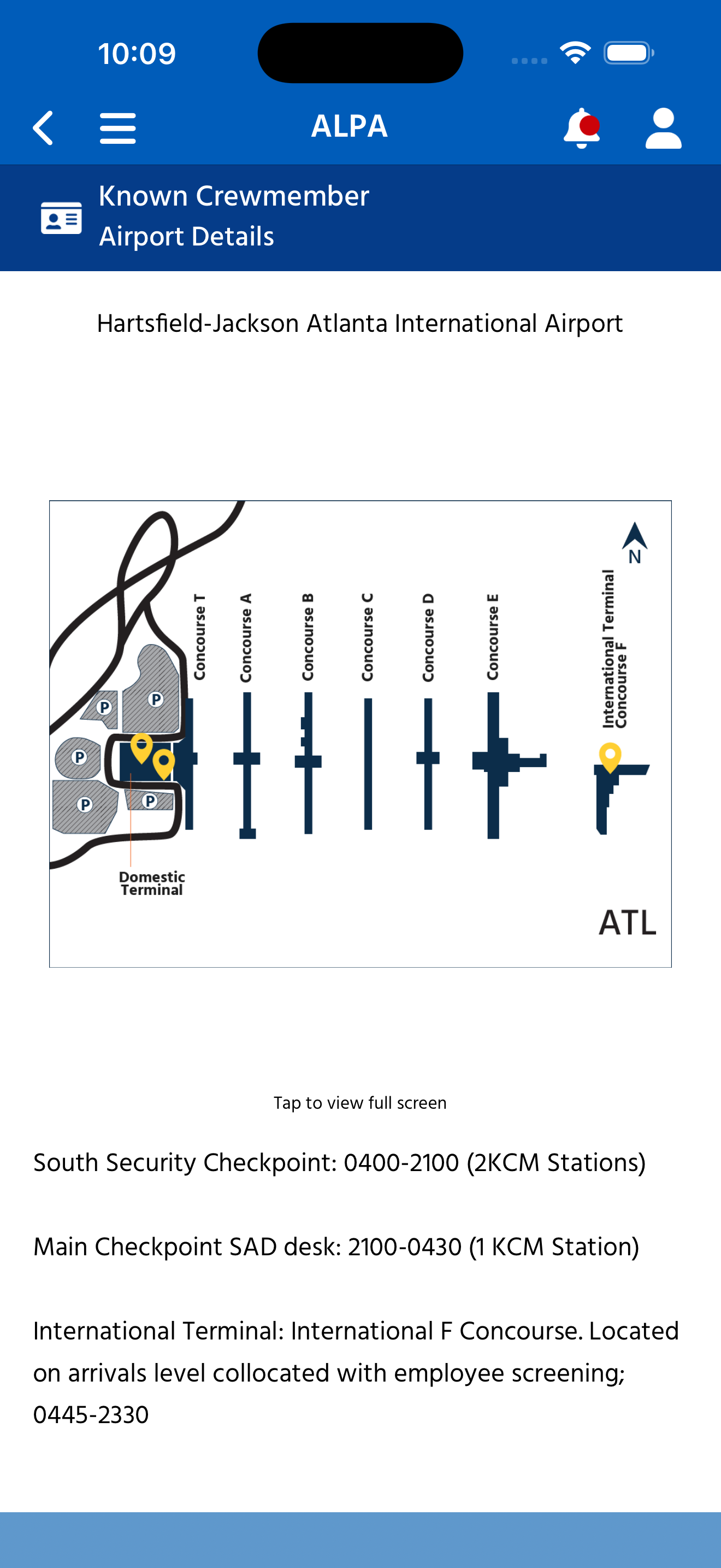
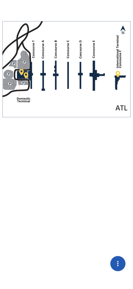
Our proposed alignment, derived from the shipped screen's content model and mapped onto real design tokens. Offered so the gap is not simply left open — please accept, amend or replace:
| Region | Content | Proposed treatment |
|---|---|---|
| Heading | Full airport name ("Hartsfield-Jackson Atlanta International Airport") | Display/XS (Lora SemiBold 16) — matches other KCM headings; wraps to 2 lines at the long end |
| Map | Schematic terminal diagram with KCM checkpoint pins, tappable to full screen | Full-bleed within page margins; "Tap to view full screen" hint below |
| Map — full screen | Same diagram enlarged, with a floating action button | Undesigned. The FAB carries no label or icon meaning in the current build — needs a designed affordance, or removal |
| Map — offline | Icon + "Map unavailable offline" + "Connect to WiFi to download and cache this map for offline use" | Same treatment as the Off the Radar empty state, on bg-no-img #F5F7FA |
| Check-in notes | Multi-paragraph operational text — checkpoint name, hours, and station count per entry (e.g. "South Security Checkpoint: 0400-2100 (2 KCM Stations)") | Body/Body M (18); needs paragraph spacing — these are discrete entries, not prose |
| Notice | Advisory text, conditional (absent on ATL) | Body/Body S (12), secondary colour |
What we need: accept the proposal, amend it, or design the screen — note this is two views, the detail and the full-screen map. If this is a legacy surface being retired, say so — we will stop investing in it rather than design it twice. The two parts most in need of a designed treatment are the offline map state (currently a bespoke fallback) and the full-screen map's floating action button (currently unlabelled).
Answered — no action needed
- Crew-role columns — confirmed as an independently maintained list of carriers supporting jumpseating by employee role. Already modelled and rendered; no data gap.
- The two Airline Policies screens — confirmed distinct, not a duplicate. KCM's badges jumpseat eligibility by crew role; Flight Finder's badges carrier affiliation (ALPA / CASS).
Other/Form FieldvsOther/Caption— identical values today, kept as separate tokens so a future change to one does not silently move the other.- Airlines list presentation — decided 2026-07-31: the Figma design
wins. The screen will be rebuilt to the persistent header and two-column check-mark grid
(
4562:7754), replacing the current pills. No design input needed. - The 28px type size in our tokens — confirmed a scaffold artifact, not a missing design style. It belongs to the bespoke KCM hero and retires with it. The Display ramp is XS 16 / S 20 / M 24; no confirmation needed.
7 · Follow-on work
This document is specification and audit only — no code was changed. The implementation work it implies:
- Replace the KCM home mock with the specified
card-smlayout, and remove the hardcoded status (KCM-1). Retire the 28px/36px hero sizes with it. - Rebuild the Airlines screen to the specified header and column grid (KCM-3, decided). Use
min-heightrows and the--fs-*scale steps — do not reintroduce fixed row heights or hard-coded type, which would regress the AB#2358 / AB#2391 work. - Fix the
StatusBadgeKind.Cassmisuse — flight attendants need their own kind (KCM-4). - Build the filter overlay (KCM-5) and the Airports list (KCM-6). The Policies detail is already built — see the correction under KCM-7; what remains there is a backend ask for four discrete policy fields plus a last-updated date, not UI work.
- Resolve the airport detail's design status (KCM-8).
- Rename the
jsffform prefix to something neutral (KCM-2). - Correct the type-style count in
typography-font-mapping.html(§ 4).