Home Page Audit
Aligned Blazor implementation (Components/Pages/Home.razor) measured against the
Figma Home design and the documented component specs, with high scrutiny.
#f4f5f7, rounded corners, decorative chevron). This audit re-derived the design
from Figma and corrected the implementation to mirror the Figma structure and tokens: Lora / Futura PT /
Inter type, #F5F7FA page, square corners, the card-lg 6px accent, card-sm rows, and the
chevron background-notch.
1 · Method
- Pulled the Home node structure with
get_metadata(exact child order, sizes, names). - Pulled design tokens with
get_variable_defs(colors, type, spacing). - Pulled per-component construction with
get_design_context(chevron paths, card-lg accent, card-sm layout, button). - Rebuilt & deployed to the iPhone 16 Pro simulator; captured each section with MauiDevFlow
screenshot+ WebViewscroll. - Compared screenshot-to-Figma and corrected discrepancies (§4–§6).
2 · Design tokens (Figma → implementation)
| Figma variable | Value | CSS var | Use |
|---|---|---|---|
| Text/Primary · Headlines · Surface/Brand · Blue/900 | #05273e | --alpa-navy | Titles, brand surfaces |
| Interactive/Blue-lt · Blue/700 · Border/Blue-lt | #007bc2 | --alpa-blue | Links, primary button, card-lg accent |
| Blue/100 | #dfedf9 | --alpa-blue-100 | Welcome body, card-sm image bg, chevron light |
| Blue/500 | #7cb9f2 | --alpa-blue-500 | Chevron mid |
| Text/Secondary | #5d6471 | --alpa-gray | Eyebrow, body copy |
| Border/Yellow | #f7bb0d | --alpa-yellow | Accent (design-driven; deferred) |
| bg-main | #F5F7FA | --alpa-page | Page background (was #f4f5f7) |
| Font Family/Heading | Lora SemiBold 600 | --alpa-heading | Titles; XS 16, S 20; lh 1.2 (was Georgia) |
| Font Family/Body | Futura PT (Book / Demi) | --alpa-body | Links 18, button 15/Demi (was system sans) |
| Font Family/Eyebrow | Inter Bold 12 | --alpa-eyebrow | Eyebrow, uppercase, opacity 50% |
| Page Margins · spacing | 16 · tiny 8 / xsmall 16 / medium 24 | --alpa-* | Layout rhythm |
3 · Structure (Figma order — now mirrored)
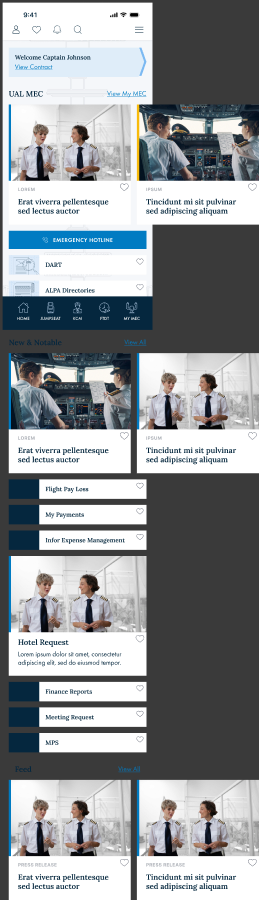
Content column is 361 wide inside a 393 frame (16px margins). Top-to-bottom from node 4099:5230:
| # | Figma node | Component | Size | Content |
|---|---|---|---|---|
| 1 | welcome (0:32) | Card (chevron) | 361×77 | Welcome Captain Johnson · View Contract |
| 2 | horizontal scrolling feed (0:40) | Carousel → card-lg ×2 | 320×315 | UAL MEC · View My MEC |
| 3 | Primary button (0:69) | Button (emergency) | 361×48 | Emergency Hotline |
| 4 | card-sm ×3 (0:80…) | CardSmall | 361×51 | DART · ALPA Directories · FTDT |
| 5 | horizontal scrolling feed (0:107) | Carousel → card-lg ×2 | 320×315 | News & Updates · View All |
| 6 | card-sm ×3 (0:137…) | CardSmall | 361×51 | Flight Pay Loss · My Payments · Infor Expense Management |
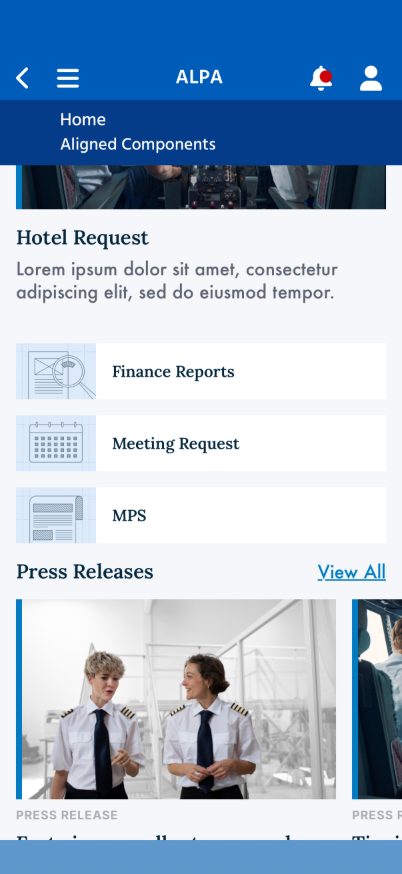
| 7 | card-lg (0:164) | HeroCard (full-width) | 361×314 | Hotel Request + description |
| 8 | card-sm ×3 (0:175…) | CardSmall | 361×51 | Finance Reports · Meeting Request · MPS |
| 9 | horizontal scrolling feed (0:202) | Carousel → card-lg ×2 | 320×315 | Press Releases · View All |
4 · Component construction
Card — Welcome / Pilot (the chevron background-notch)
The chevron is Group 568, a 20×74 strip at the card's right made of two layered arrows:
#7CB9F2 (Rectangle 453) behind
#DFEDF9+#007BC2
stroke (Rectangle 451). The triangular gaps above and below the point are transparent — they must
reveal the page background so the card reads as angle-clipped.
#dfedf9) lives only on
.alpa-card-chevron-body; the card container is transparent, so the gaps reveal bg-main
and the chevron clips on the angle — exactly as requested.
card-lg (feed item + full-width hero)
- Image 200px, 6px left border
#007bc2(Border/Blue-lt), object-cover. - Content pt 8 / pb 24 / px 0. Favorite heart present in Figma and shown (D31).
- Eyebrow: Inter Bold 12,
#5d6471, opacity 50%, uppercase, tracking 0.6. - Title: Lora SemiBold 20,
#05273e, lh 1.2. Hero adds a Futura PT 18 description. - 320 wide inside a feed track; full width as a standalone hero.
card-sm (list row)
White row, square, ~51px: an 80px image block backed by Blue/100 + a Lora SemiBold 16 title. Padding 16.
Primary button
361×48, #007bc2, square, icon-text gap 12, Futura PT Demi 15, letter-spacing 4, uppercase, white;
emergency uses an inline phone glyph.
Horizontal scrolling feed
Section header (Lora SemiBold 20 title + Futura PT 18 underlined View-All) over a horizontally-scrolling row of card-lg with a 16px gap.
5 · Discrepancy log
| # | Area | First pass | Figma | Status |
|---|---|---|---|---|
| 1 | Chevron | Solid blue decorative arrow | Angle-clip; gaps = page bg | Fixed |
| 2 | Structure / order | Draft mock order | welcome→feed→button→rows→… | Fixed |
| 3 | Page bg | #f4f5f7 | #F5F7FA (bg-main) | Fixed |
| 4 | Heading font | Georgia | Lora SemiBold | Fixed |
| 5 | Body / button font | System sans | Futura PT | Fixed |
| 6 | Eyebrow font | system, no tracking | Inter Bold, op 50%, uppercase | Fixed |
| 7 | Corners | 10px rounded | Square (0) | Fixed |
| 8 | Card large accent | thin/none | 6px blue left border | Fixed |
| 9 | List rows | no-image text carousels | card-sm (80px img + title) | Fixed |
| 10 | Button | rounded, 16px, no tracking | square, Futura Demi 15, ls 4 | Fixed |
| 11 | View-All margin | touched screen edge | inside 16px margin | Fixed (overflow-x) |
| 12 | Favorite heart | hidden | present in design | Shown (D31, 2026-06-26) |
6 · Visual comparison
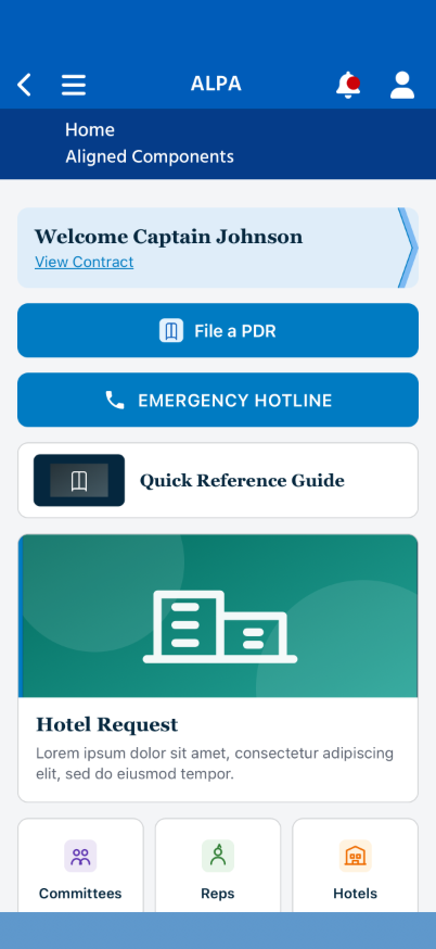
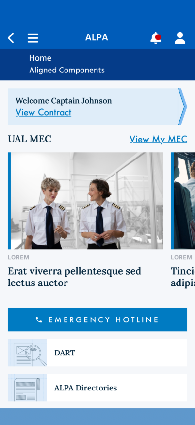
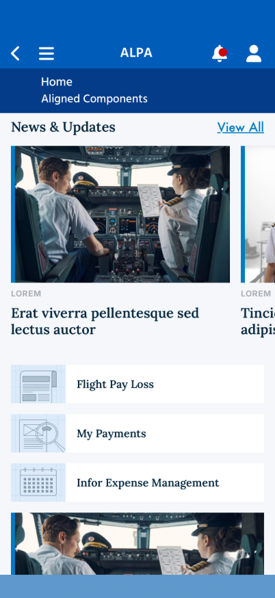
7 · Residual notes
- Futura PT is not a Google-Font; the WebView falls back to iOS system Futura (same family).
If exact Futura PT is required, bundle the licensed web font as
@font-face. - Feed bleed: Figma cards bleed to the right screen edge; the implementation insets them 16px so the page margin holds. A negative-margin full-bleed track is a possible refinement.
- Yellow accent (Border/Yellow) is available as
CardHeroViewModel.AccentColorbut is not applied by the mock — pending the design rule (backend open question #6). - Imagery is taken from the Figma design's own asset fills — pilot photos (
pilots.jpg,cockpit.jpg) for card-lg and the line-art illustrations (doc-review.png,news.png,calendar.png) for card-sm — exported via the Figma MCP, optimized, and bundled underwwwroot/images/figma/. Real feeds will supply images via the API.