Member Resources Destinations — Design Gap
The gap
First, a staleness correction
The XAML → Blazor Coverage Map
(2026-08-03) recorded these four screens as State 3 — absent — and their rows on
/member-resources as dead ends, every one built with
Link = "/member-resources". That finding is stale for this build.
As of commit 34737cb4 (verified live 2026-08-12) the rows navigate to four live
routes, and each route renders. What has not changed is the design side: all four
were built without a Figma design source, and each page's own header comment says so.
The four destinations are the four rows of the Figma member resources list frame
(4870:10671): In Case of Emergency, International Directory, Membership Card, Orange Card.
The frame designs the list; no frame designs any destination. The Blazor
pages therefore derive their layouts from existing app patterns — CardSmall rows,
the .alpa-mres-detail static-copy block, the .alpa-profile-*
identity block — each choice recorded in the page's comment along with its work item
(AB#2433, AB#2434, AB#2436, AB#2435 respectively, under the AB#2403 parent).
These are derived layouts awaiting ratification, not designs. Where the native screen had a structure the pattern could not carry — the membership card's front/back flip carousel, the orange card's two swipeable cards — the Blazor version flattened it into stacked sections. Those simplifications were engineering calls made in a design vacuum.
What ships today
| Screen | Native (XAML) | Blazor (this build) |
|---|---|---|
| In Case Of Accident | InCaseOfAccidentPage — list of six sub-topics, each opening CMS-authored text |
/member-resources/in-case-of-accident (AB#2433) — same list from GetInCaseOfAccidentListAsync, CardSmall rows, detail via InCaseOfAccidentDetailPage; “Numbers To Call” redirects to Orange Card, matching native |
| International Directory | InternationalDirectoryPage — search over a region-grouped country list with per-country drill-down |
/member-resources/international-directory (AB#2434) — same data (GetInternationalDirectoryAsync), search matching continent or country, sticky search box and continent headers |
| Membership Card | MembershipCardPage — front/back flip-card carousel over globe artwork: name, classification, airline, member number, scannable barcode |
/member-resources/membership-card (AB#2436) — single stacked page, .alpa-profile-* identity block, EAN-8 barcode rendered as first-party inline SVG behind a tap; redirects to /login when signed out |
| Orange Card | OrangeCardPage — two swipeable carousel cards: hotline copy from hardcoded HTML, plus the safety guide |
/member-resources/orange-card (AB#2435) — static content ported verbatim, stacked sections under .alpa-mres-detail-*, tel: links for hotline and backup line |
Side by side
Blazor captured 2026-08-12 on an iPhone 17 Pro Max simulator (iOS 26.4), build commit
34737cb4, against live data. The native captures are the reference set from the
coverage map's earlier signed-in session.
In Case Of Accident
Native (XAML, shipped today)
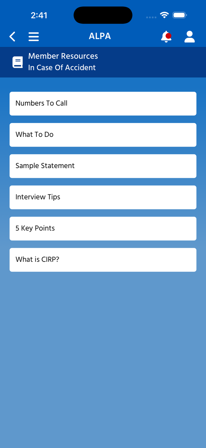
InCaseOfAccidentPage — a list with children Not a leaf: six sub-topics (Numbers To Call, What To Do, Sample Statement, Interview Tips, 5 Key Points, What is CIRP?), each opening its own text. Native labels the screen In Case Of Accident; the Figma list-frame row says In Case of Emergency.
Blazor (this build, for review)
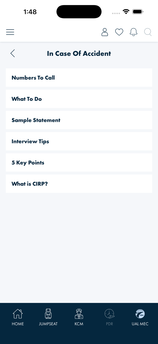
Live list, derived row pattern
The same six CMS topics from GetInCaseOfAccidentListAsync, rendered with
CardSmall — the row component the parent Member Resources list already
uses. “Numbers To Call” redirects to Orange Card instead of opening a
detail, matching native's special case. Blazor keeps the native label.
International Directory
Native (XAML, shipped today)
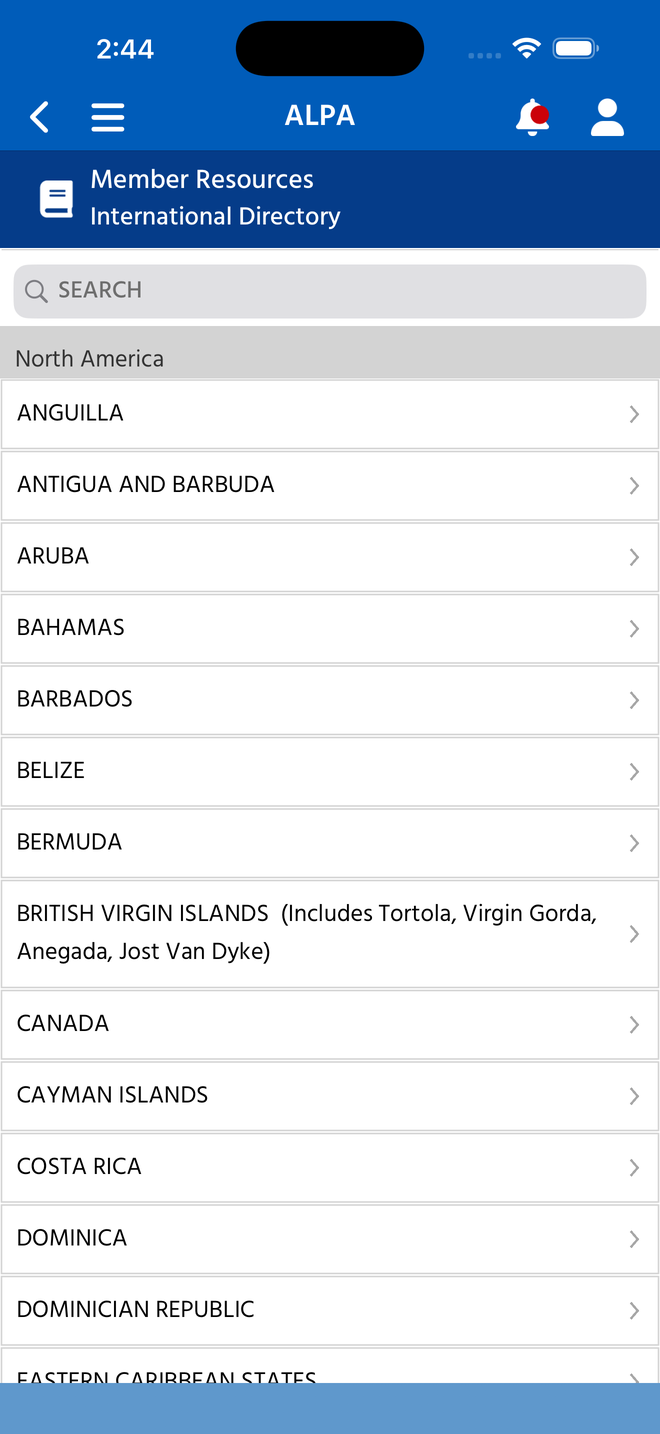
InternationalDirectoryPage — grouped and searchable Search field over a sectioned list with region headers and chevron drill-down per country. The most structurally involved of the four destinations.
Blazor (this build, for review)
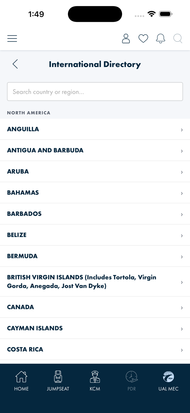
Live data, sticky chrome
Search plus region-grouped country list from GetInternationalDirectoryAsync,
rendering live-looking data at capture. Search matches a continent heading or a country
name; the search box and continent headers are sticky, reproducing the native iOS
pinned-section-header effect. Rows reuse the shared search-page list pattern.
Membership Card
Native (XAML, shipped today)
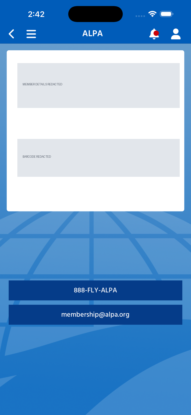
MembershipCardPage — redacted capture White card over the globe artwork with name, classification, airline and member number above a scannable barcode, two contact CTAs beneath. Member details and barcode are redacted — the live screen renders member PII and a scannable credential.
Blazor (this build, for review)
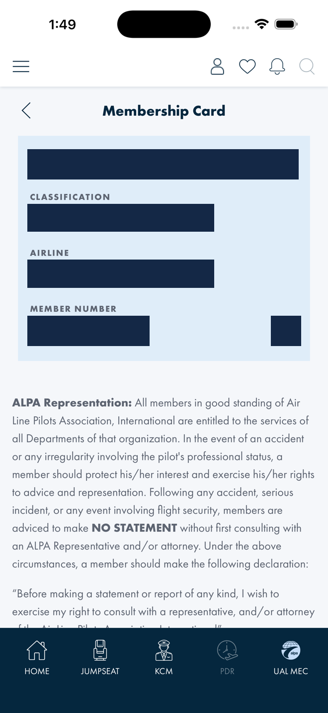
Live card — this capture is PII-redacted too
Member name, classification, airline, member number and the barcode are blocked out in
this capture, same treatment as the native one. The live page renders the signed-in
member's identity block (.alpa-profile-* pattern) with the EAN-8 barcode
behind a tap, drawn as first-party inline SVG. Signed out, the route redirects to
/login.
Orange Card
Native (XAML, shipped today)
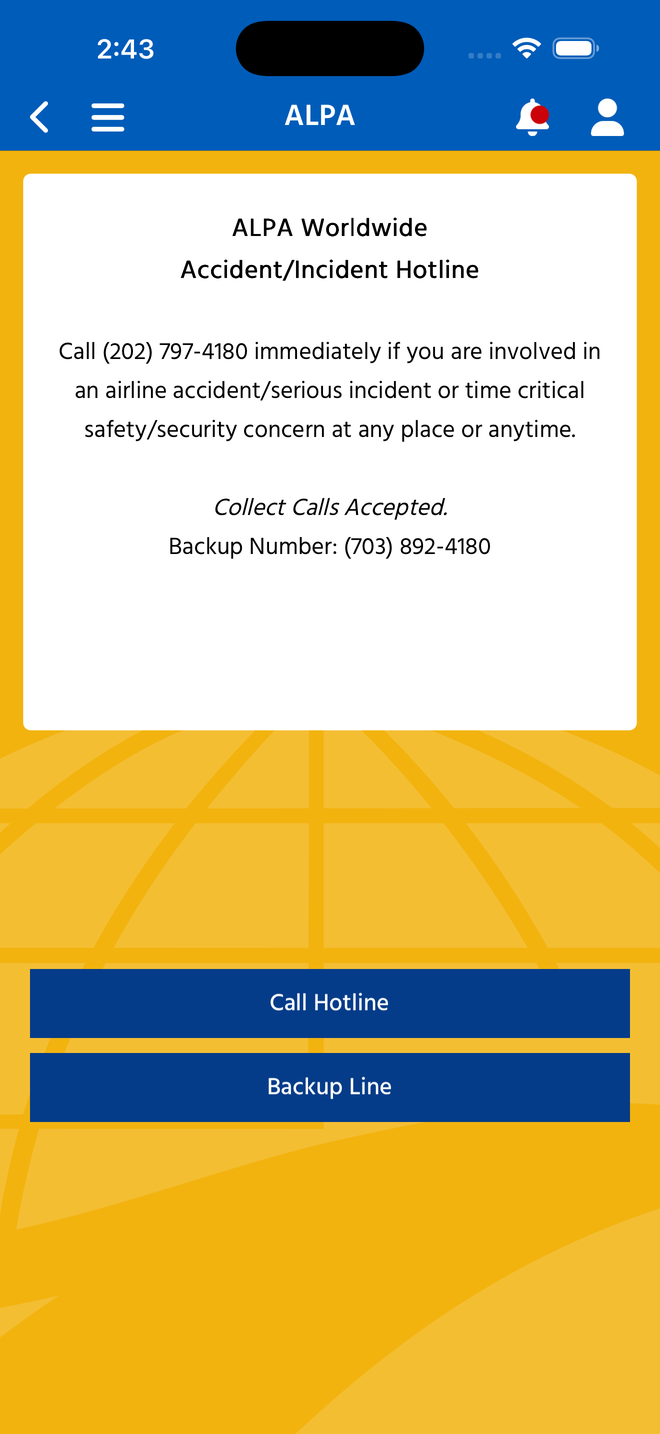
OrangeCardPage — carousel cards Amber-themed emergency card: hotline copy rendered from hardcoded HTML, Call Hotline and Backup Line CTAs, presented natively as two swipeable carousel cards. No member data.
Blazor (this build, for review)
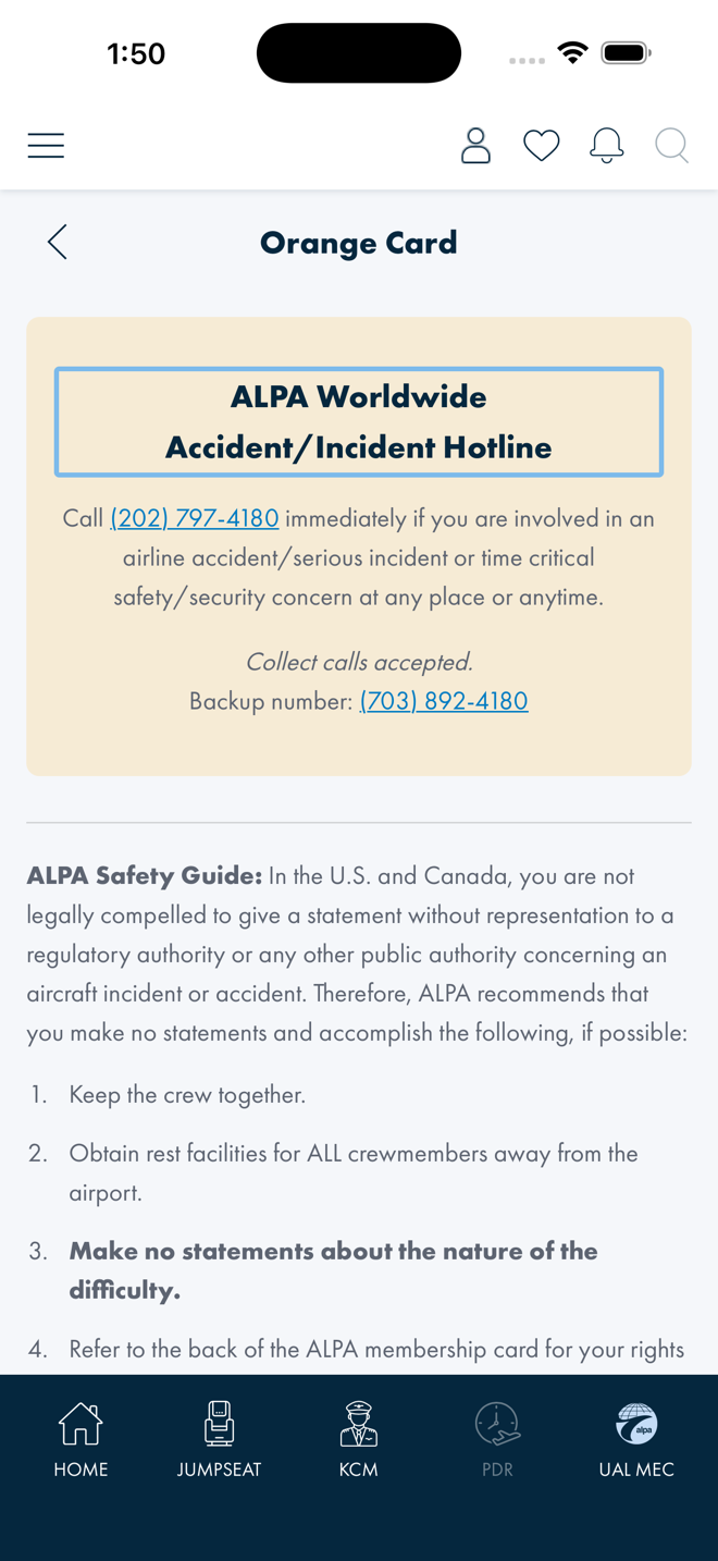
Same copy, stacked Hotline card plus the safety-guide block as stacked sections — the carousel is not reproduced. Content ported verbatim from the native page's hardcoded strings, with tel: links for the hotline and backup line.
Verification
Walked live on an iPhone 17 Pro Max simulator, build 34737cb4, signed-in member account:
Each route was reached from its row on /member-resources — the navigation the
coverage map recorded as broken — and checked for the Blazor error banner after landing.
All four rendered. The “no Figma frame” claims are not inferred: each page's
header comment states it explicitly, with the work item that built the page.
Open questions
| # | For | Question |
|---|---|---|
| 1 | Design | Do these four screens get designed frames, or is the derived pattern set (CardSmall rows, .alpa-mres-detail static copy, .alpa-profile-* identity block) ratified as their design? They ship either way — the question is whether what shipped becomes the spec. |
| 2 | Comms | Which label is canonical: In Case Of Accident (native and Blazor) or In Case of Emergency (the Figma member-resources frame row)? The app and the design source currently disagree on the row's name. |
| 3 | Design | Membership card: native presents a front/back flip-card carousel over globe artwork; Blazor presents one stacked page with the barcode behind a tap. Is the card artwork part of the member experience worth designing, or is the flat identity block enough? |
| 4 | Design | Orange card: native's two swipeable cards became stacked sections. For an emergency screen, is stacked (everything visible on scroll) actually the better shape — and should that ruling apply to the membership card too? |
| 5 | Product | Any Membership Card capture — native or Blazor — must be redacted before it is committed or shared, which makes the screen hard to document and review. Should a mock-member state exist for documentation and design review? |
References
ALPAMobile.Presentation/Components/Pages/InCaseOfAccidentPage.razor(+InCaseOfAccidentDetailPage.razor) — AB#2433ALPAMobile.Presentation/Components/Pages/InternationalDirectoryPage.razor(+InternationalDirectoryDetailPage.razor) — AB#2434ALPAMobile.Presentation/Components/Pages/MembershipCardPage.razor— AB#2436ALPAMobile.Presentation/Components/Pages/OrangeCardPage.razor— AB#2435ALPAMobile/Pages/InCaseOfAccidentPage.xaml,ALPAMobile/Pages/InternationalDirectoryPage.xaml,ALPAMobile/Pages/MembershipCardPage.xaml,ALPAMobile/Pages/OrangeCardPage.xaml— the native pages- XAML → Blazor Coverage Map — the (now corrected) dead-end finding and the native reference captures
- Member Resources — Domain-Control Data-Gap Analysis