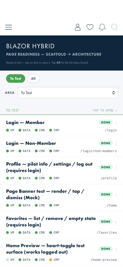
Where you land — the Area dropdown on its default.
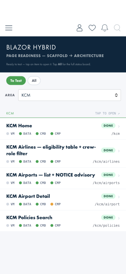
The same screen with KCM chosen — only that area's screens.
TLDR: Open the app → you land in the new design already, on Home → open the ☰ menu (top-left) and tap Page Readiness. That screen lists everything currently ready to try out — tap any item to open it. Then follow that item's linked Tester Walkthrough: a step-by-step guide with screenshots showing exactly what to check and what "something's wrong" would look like.
This guide is written for anyone doing hands-on testing of ALPA Mobile — you don't need any coding background to use it. If you're looking for the automated test suite or how to join the TestFlight/Google Play beta instead, see testing.html.
The app now opens straight into the new design — you land on Home, not on the old grid of tiles. From any screen there, open the ☰ menu (top-left) and tap Page Readiness.
Looking at the old app instead: the previous design is still installed and unchanged. In that same ☰ menu, tap Exit to Native Home and you are back on the old grid of tiles, free to compare anything against it. To come back to the new design, tap the Blazor Dev tile — the first tile in that grid. You can go back and forth as often as you like, and the new design picks up where you left it.
If you are not signed in — or your saved sign-in has expired — the app opens on the log-in screen instead. Sign in and you land on Home.
Pick your area first. The Area dropdown under the tabs filters the list to one part of the app. It opens on the first area, so if you are testing something else — KCM, Notifications, FTDT — choose it there rather than scrolling. Choosing Show all lists every area at once.
Where you land — the Area dropdown on its default.
The same screen with KCM chosen — only that area's screens.
▶ Automated UI-test replay — PageReadiness_RendersToTestIndex (BlazorWalkthroughTests).
Recorded before the Area dropdown was added, so the clip shows the unfiltered list.
The Page Readiness screen, "To Test" tab — your starting point for manual testing.
This screen is a checklist the team uses to track which parts of the new app design are ready to try and which are still being built. The main thing you'll use is the To Test / All switch at the top.
You don't choose a data source — each screen is wired to either real ALPA content or contract-shaped sample content, decided by the engineering team per screen (as of 2026-07-09; the old Mock data / Live data switch is gone from this screen — it now lives on the FTDT dashboard and only affects FTDT scenario testing). Notifications, KCM lists, and flight search use real systems; the Home Preview feed, menu tiles, favorites, and page banners use sample content shaped exactly like the real thing.
One thing worth knowing up front: the promotional banner that can appear at the top of Home, KCM, and Member Resources always shows a sample campaign (so you can test opening/dismissing it any time) — it is not a live ALPA announcement.
Each item shows a small colored label telling you how ready it is:
You may also notice a row of small colored dots next to each item in the All list — those are fine-grained progress notes the engineering team uses internally. You don't need to know what they mean; the status label above them is all you need to decide what's worth testing.
One row on the list isn't a feature to test — it's a utility. Auth Status / Log Out shows whether you're currently logged in and lets you log out. Use it whenever a walkthrough asks you to start from a logged-out state.
This list mirrors the app's To Test tab one-to-one, so you can follow along between the app and these docs. Each row links to its Tester Walkthrough — a step-by-step guide with screenshots that tells you exactly what to do, what you should see if it's working, and what it would look like if something's broken.
| To Test row (as shown in the app) | What it is | Walkthrough |
|---|---|---|
| Login — Member | The ALPA member sign-in screen. | Login & Logout (Checks 1–3) |
| Login — Non-Member | The non-member sign-in path, including the "did you mean the Members screen?" prompt. | Login & Logout (Check 7) |
| Page Banner test — render / tap / dismiss (Mock) | The promotional banner slot on Home / KCM / Member Resources, always stocked with a sample campaign. | Promo Banner |
| Favorites — save / list / remove / empty state (requires login) | Your saved items: viewing, removing, the empty state, and the "content no longer available" fallback. | Favorites |
| KCM Airlines / Airports — eligibility, filter, airport details (works logged out) | Which airlines let pilots and flight attendants use KCM, filtering that list by crew role, the airports list with its NOTICE advisory, and each airport's check-in details. | Known Crewmember (KCM) |
| Home Preview — heart-toggle test surface (works logged out) | The test home page: magazine carousel, document category rows, and the save-a-favorite hearts (once signed in). | Favorites (Checks 2–3) |
| Profile — pilot info / settings / log out (requires login) | The pilot profile screen (person icon in the top bar): name, member number, pilot-group links, the Settings section with Notification Settings, and the LOG OUT button. | Login & Logout (Checks 4–5 cover log out; profile walkthrough to follow) |
| Advocacy — PAC contributions / calls to action (requires login) | Your ALPA-PAC contribution card with its three website links, the meeting-report hand-off, and the Calls to Action list. | Advocacy |
| Notifications — Comms + Flight Finder | The two notification feeds: the Comms inbox with its audience filter, and Flight Finder alerts about flights you asked to be notified about — including a flight's full update history. | Notifications |
| Push / Deep-link Test Scenarios | Opens the routes a tapped push notification opens, so the behaviour can be checked without waiting for a real notification to arrive. | Notifications (Checks 7–8) |
| Empty State Scenarios (all areas) | Utility row — every empty state in one place, grouped by what it takes to reach one. Built for design review rather than as a feature to test; useful when you need to see what a screen does with nothing on it. | No walkthrough — the page explains each row in place. |
| Auth Status / Log Out | Utility row — shows whether you're signed in and lets you log out. Not a feature to test by itself, but several walkthroughs use it. | Login & Logout (Checks 4–5) |
Beyond the To Test list, the readiness screen has one more tappable section — FTDT — covering the new Flight Time / Duty Time tracker (dashboard, duty-period forms, and the beta rest-rules work):
| FTDT section rows | What they are | Walkthrough |
|---|---|---|
| FTDT Dashboard · Duty Period List · Select Op Type · Add / Edit Duty Period · Add Flight Segment / Rest / Note · Test Scenarios (Beta) | The Flight Time / Duty Time tracker: cumulative limit bars, duty-period management, the beta §117.25 / §700.43 rest-rules engine, and a scenario seeder that stages known states without touching your real records. | FTDT |
| Jumpseat section rows | What they are | Walkthrough |
|---|---|---|
| Flight Finder Search · Flight Finder Results · Airline Policies · Recent Searches · Saved Searches · Saved Flights · FF Test Scenarios (Mock) | Jumpseat flight search against the live flight-search service: search form with typeahead and guard rails, expandable flight cards with per-leg live statuses, staged sort/filter, airline jumpseat-policy directory and detail, and the saved/recent lists (sample data until persistence lands). | Flight Finder |
| Member Resources section rows | What they are | Walkthrough |
|---|---|---|
| Member Resources — resource list · Orange Card · In Case of Accident · International Directory · Membership Card | The resource list and its four destinations: the Orange Card numbers, accident-response topics, the international directory with its sticky search, and your membership card with barcode (requires login). | Member Resources |
| Documents section rows | What they are | Walkthrough |
|---|---|---|
| Internal Comms (categories → article lists) · Document viewer — Canadian Limits PDF (fit-to-frame + pinch zoom) · MEC Documents (save a favourite here) | The ALPA document library (requires login): category lists, and the in-app viewer that renders PDFs fitted to the screen and HTML documents reflowed to it. | Documents · hearts on MEC Documents: Favorites |
Three walkthroughs have no row of their own because they cut across screens — start them from the rows named inside each:
walkthroughs/<feature>/ directory as your authoring draft.screen-assets/ folder next to the doc.