Updated: 2026-08-22 08:19 ET · Screenshots captured live on iOS simulator: checks 3 and 4 (live data, status icons, icon legend) 2026-08-15, check 5 2026-08-12 ·
On the Page Readiness screen set the Area dropdown to Notifications — it opens on the first area, so these rows are hidden until you pick it — then look for: Notifications — Comms + Flight Finder and
Push / Deep-link Test Scenarios
TLDR: 7 checks across the Notifications screen — reading the
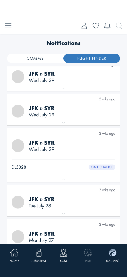
two tabs, filtering the Comms inbox, scanning the flight alert list grouped by flight, opening a card
to see when the flight departs, and confirming that tapping a push notification takes you to the alert
it was about rather than dumping you at the top of a list. Checks 1–3 need no login. The flight alerts
you see may be a sample flight — the screen says so when they are.
Before you start
No login needed for the flight-alert checks. The Comms inbox also loads logged out.
You will probably see a sample flight. Flight alerts are tied to flights you have asked to
be notified about. If you have never used notify me on a flight, the tab shows a real sample
flight so there is something to test, and a yellow note at the top says so. That note disappearing is
how you know you are looking at your own flights.
You do not need to wait for a real push to arrive. Check 5 posts one to your own device
from the Push / Deep-link Test Scenarios row on the Page Readiness screen, and that row's
siblings replay what a tapped notification opens if the banner never reaches you.
Checks
1 · Open Notifications and switch tabs
Steps: From Page Readiness, tap Notifications — Comms + Flight Finder. Then tap
FLIGHT FINDER, then COMMS again.
What you should see: Two pills at the top. COMMS is selected when you arrive and
shows a list of ALPA and MEC messages. FLIGHT FINDER shows flight alert cards. The filter icon
in the top-right belongs to Comms only and disappears on the Flight Finder tab. Switching away from
a tab counts as having read it: any red unread dots on the list you just left are gone when you
come back to it. Leaving the Notifications screen entirely does the same for both tabs — the same
rule the native app applies.
Something's wrong if: Both tabs show the same content, or the filter icon
stays visible on the Flight Finder tab — there is nothing for it to filter there.
2 · Filter the Comms inbox, then clear it
Steps: On the COMMS tab, tap the filter icon (top right). Tick an audience, tap
Apply. Then reopen it and tap clear.
What you should see: The list narrows to that audience and a small count badge appears on
the filter icon. Clearing restores the full list and removes the badge.
Something's wrong if: The filter offers an audience that then matches
nothing — the options are built from the messages actually in your list, so every option should
return at least one. If a filter does leave you with nothing, the screen must say that the
filter is the reason, not that your inbox is empty.
3 · Read the flight alert list at a glance
Steps: Switch to FLIGHT FINDER and read down the list without opening anything.
If you have alerts for more than one flight, this is the check that matters most — subscribe to a
second flight in Flight Finder first if you only have one.
What you should see: Alerts grouped by flight, not one long stream. Each group
starts with a pale blue header bar carrying the route (ORD » DEN), the flight
number beside it, and a count on the right — 3 updates. Tapping the header collapses that
flight's alerts and tapping it again brings them back; groups start open. Beneath each header are
that flight's white cards, newest first, each with the time the alert arrived in the top-right
corner. Each card leads with a pill saying what changed — GATE CHANGE, ARRIVAL
UPDATED, TIMES UPDATED, DELAYED, CANCELLED — with how long ago the alert
arrived on the same line, and beneath it the alert's own sentence: "AA4216 from ORD to DEN
now departs from gate L10B." The sentence is the only place the specifics appear — the pill says
GATE CHANGE, the sentence says which gate.
When one alert reports several changes at once — a gate move, new times and a delay in
the same sentence — the pill names the most consequential one, not the first one
mentioned. The order is: cancelled, then delayed, then gate, then times. So an alert reading
"now departs from gate T12, departs at 21:29, arrives at 23:36, has a status of Delayed" shows a
DELAYED pill with the amber triangle, even though a gate is named first in the sentence.
That is correct, not a mislabel — the sentence beneath still lists every change. Before
2026-08-19 that same alert showed GATE CHANGE and the delay was invisible on the card.
A red dot beside the elapsed time marks alerts
you have not seen yet; it clears when you open the alert, switch tabs, or leave the screen.
Neither the route nor the flight number is repeated on the card, because the group header directly
above already carries both.
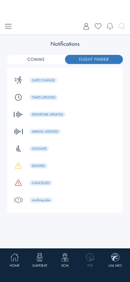
Every pill looks the same — same blue, whatever the change. That is deliberate: the
icon on the left is what carries urgency. A gate change shows a figure hurrying, a time
change a clock, a departure a plane with a bar behind it and an arrival the same plane with the
bar ahead of it, an out-gate a jumpseat. Delays are an amber warning triangle and
cancellations a red one — those two are the only coloured icons on the screen, so anything
coloured is worth reading first. An alert we cannot classify gets a grey warning light rather
than a guessed icon.
Every icon, in one place. You will not see most of these on a normal
pass — a flight has to actually be delayed or cancelled for those two to appear, and
DEPARTURE UPDATED needs an alert that changes the departure without touching the arrival,
which we have never seen the live service send. Use this to check the glyph matches the pill on
whatever you do get, rather than expecting to collect the set.
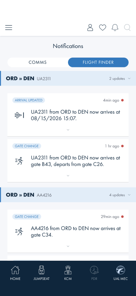
One flight's alerts under its header. Each card is a pill, how long ago, and the
alert's own sentence — which is the only place the actual gate appears.
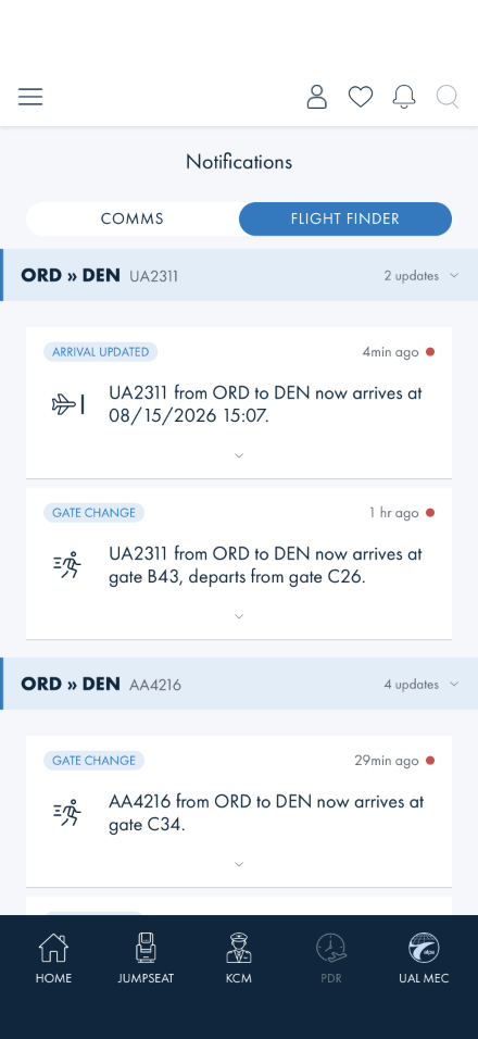
Where one group ends and the next begins. Different flights on the same city
pair stay separate, and the pill differs per alert — ARRIVAL UPDATED above
GATE CHANGE.
Both shots are live data, not the sample flight. The yellow sample note appears
only when you have no subscriptions of your own.
Why the grouping matters. Alerts do not always arrive in the order the
changes happened — a gate assignment can turn up after the arrival-time change that came before it.
Reading one alert alone tells you what changed but not what is true now. A flight's group is where
that ordering becomes readable, which is the whole reason the list aggregates by flight rather than
running one long stream. Read a group with that in mind and flag anything that reads as
contradictory.
Something's wrong if: The timestamps are out of order, a card shows no route
at all, the red dot survives on an alert you have already opened, or — the new one to watch for —
alerts for two different flights end up under the same header, or a group's count does not
match the number of cards under it. Two flights on the same city pair must stay in separate groups.
Worth reporting, not a bug: the date under the card is the flight's departure, and it
comes from the flight you saved when you subscribed. If you have deleted that saved flight, the
card falls back to showing when the alert arrived and says NOTIFICATION RECEIVED above it —
that is expected. What is worth telling us is whether the departure date is the more useful thing
to see there. Also expect the route to appear twice for now, once on the header and once on the
card; that duplication is known and under review.
4 · Open a card's date, and check it does not close the others
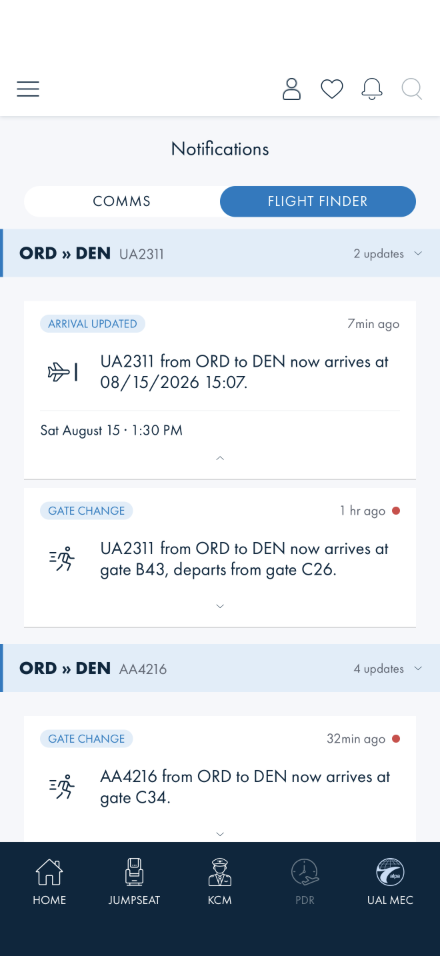
Steps: Tap the small caret at the bottom of a card. Then tap the caret on a different one.
What you should see: A line appears with the date and time — either the flight's own
departure, or, when the flight is no longer in Saved Flights, the time the alert arrived
labelled NOTIFICATION RECEIVED. That is all the caret reveals: what changed and the
alert's own wording are on the card already, so this is context rather than substance. The caret
flips while the line is showing. Opening a second card leaves the first open — this is no
longer an accordion, and you can have as many showing as you like.
Entering from the readiness row (?showcase=true) adds more below that line: a
Sent row (the server's send time from the payload — the app never records when the device
received it) and VIEW FULL DETAILS ›. That is the alternate detail view, kept
deliberately so the design team can compare the retired richer card against the drawn one (see the
notes). Production entries — a push tap, the bell — show only the date line.
That link is not part of this walkthrough. It opens a per-flight update history screen
that predates the grouped list: it lists every alert for one flight on a page of its own. The list
now does that job — a flight's group header and its cards are the same set of updates, in the same
order — so the screen survives as a design-comparison surface rather than something a member is
meant to reach. Nothing to test there; if you land on it, back out and carry on.
Captured on an engineering build — the raw Flight reference row in the
showcase view is debug-only and does not appear on the ad-hoc/UAT builds testers run.
Something's wrong if: Opening one card closes another, the caret
does not flip, the divider sits above the NOTIFICATION RECEIVED label instead of above the
whole revealed block, or the red unread dot survives on an alert you have opened.
5 · Tapping a push notification lands you on the alert it was about
Steps: The truest version is the real thing: from Page Readiness open Push /
Deep-link Test Scenarios and tap Real push tap → post a local notification. About five
seconds later an actual OS notification arrives carrying a real alert's payload — the banner shows
even with the app open. Tap the banner.
What you should see: The Flight Finder tab opens with that alert scrolled into
the middle of the screen and its date line already open, under its own flight's group header.
Arriving from a push is the one case where you did not pick the card off a list, so it should be
the only card opened for you.
Something's wrong if: You land on the right tab but have to scroll to find
the alert, the list opens at the top with nothing opened, or a card other than the tapped one is
open. Landing somewhere that makes you hunt for the thing you tapped is the failure this check
exists for — and it is more likely now that the list is grouped, because the target can
sit under a header several sections down.
If you cannot get a real notification through (Do Not Disturb, permissions
declined, a simulator that swallows banners), the same scenarios screen replays the exact route a
push produces without the OS involved: Push tap → alert further down the list is the one
that matters, since a target below the fold is where the scroll actually breaks. Push tap →
newest alert is the same behaviour at the top, and Push tap → alert no longer in the
feed stands in for tapping a days-old notification — that one should leave you with a normal,
usable list and no error.
6 · The system back gesture (Android) closes sheets and pops drill-ins (2026-08-21, AB#2533)
Steps: On an Android device, from Notifications: open the Comms filter sheet, then use the
system back gesture (swipe in from the screen edge). Next open a flight's update history (Check 4's
history link) and back-gesture again. Finally, on the Notifications list itself, back-gesture once more.
What you should see: First back closes the filter sheet and leaves you on the list. Second back
pops the history screen back to the list. Third back, from a top-level screen, returns to the app's start
destination (Home) rather than exiting the app.
Something's wrong if: Back with a sheet open navigates away underneath the sheet,
back from history jumps to Home instead of the list, or a single back on a top-level screen quits the
app.
Note: iOS has no system back gesture on this surface; use the on-screen back
chevron and the sheet's close control there. Written from the delivered fix; not yet re-walked on a
device for this guide.
7 · A phone number in a notification asks before dialing (2026-08-20, AB#2498)
Steps: Find a Comms notification whose action is a phone number (a "Call …" action). Tap it.
What you should see: The phone's own call confirmation appears (iOS: the "Call number?"
sheet; Android: the dialer opens with the number filled in, waiting for you to press call). Cancelling
leaves you on the notification. The same applies to phone numbers in the drawer.
Something's wrong if: The call starts immediately with no confirmation, or the
tap does nothing at all (the pre-fix drawer dialer was dead).
Note: The live Comms feed may have no phone-number action on a given day; if none
is present, report "no tel action available" rather than skipping silently.
What's already covered by automated tests
These run with the unit suite, so a regression should be caught before it reaches you. Run the
checks by hand anyway — the automation checks the behaviour is present, not that it reads
well:
Check 3 — the status labels behind the pills, including that a cancellation outranks anything
else in the same message (Classify_LabelsTheChangeSoTheListIsScannable,
Classify_PrefersTheMoreConsequentialFactWhenAMessageReportsSeveral)
Check 5 — the deep link the push handler builds matches what the screen reads
(DeepLinkRoute_MatchesTheQueryParametersTheNotificationsPageReads)
Sample-flight behaviour — that it only ever appears when you have no flight subscriptions of
your own (SubscribedAudiences_NeverMixesTheDemoAudienceIntoRealSubscriptions)
Notes for this release
Flight alerts and Comms come from two different services. If one tab is empty and the
other is not, that is not necessarily a bug — say which tab in your report.
The card now matches the design team's card exactly; the list is still ours. As of
2026-08-12 the card face was implemented from the delivered Figma design. It has since moved
beyond it, deliberately and on request (AB#2469): alerts are grouped by flight, the pill moved up
beside the elapsed time, the alert's sentence was promoted onto the card face, the route and
flight number came off it because the group header carries them, and the caret now reveals only
the date. Each of those is a departure from the drawn card, recorded here rather than left for a
reviewer to discover. One deliberate
exception: entering from the readiness row turns on the alternate detail view
(?showcase=true), which restores the retired richer expanded detail — message,
sent time, flight reference, history link — kept so the design team can compare it against
the drawn card, which lacks that context. The status icons are ours too: the design draws a flat
grey disc in that slot — a placeholder with no glyph assigned — and it is now filled from a
supplied icon set, keyed off the same classification the pill uses so the two cannot disagree.
Only DELAYED and CANCELLED are tinted, on the same tokens the flight card's own
status chip uses for those states.
Notification Settings has a known defect. Opening it while signed out shows an error
banner (it needs a login to read your subscriptions). Known, tracked, no need to report.