Updated: 2026-08-22 09:30 ET · No readiness row — this is a device-settings check; any screen with
the tab bar will do. Screenshots captured live on an iPhone 16 simulator at the largest accessibility size
(app scale 2.0×).
TLDR: 6 checks with the system text size turned up: everything in
the app gets bigger (up to 2× at the largest accessibility size); at the large sizes the tab bar drops its
labels and grows its icons; hero cards drop their image so the words get the space; the menu drawer keeps
its MY MEC card pinned to the bottom with the list scrolling above it; a change made while the app is open
is picked up without a restart; and ALPA web pages opened inside the app scale too.
Before you start
Note your current text size so you can put it back afterwards.
iOS: Settings → Accessibility → Display & Text Size → Larger Text; turn on
Larger Accessibility Sizes and drag the slider to the right-hand end. Android: Settings → Display → Font size (and Display size) to the largest step. Simulator (engineers):xcrun simctl ui <udid> content_size accessibility-extra-extra-extra-large;
… content_size large restores the default.
Log in — the five-slot tab bar (HOME · PDR · JUMPSEAT · KCM · your MEC) and the MY MEC drawer card
are the things under test.
Where the switch happens: the "large" treatment (icons-only bar, image-less hero) starts at the
first accessibility size on iOS and at Android's 1.5× step. The ordinary Large / XL / XXL / XXXL
sizes keep labels and images — text just grows.
Checks
1 · Largest text: the tab bar goes icons-only, hero cards drop their image
Steps: Set the largest text size (see above), then open the app on Home.
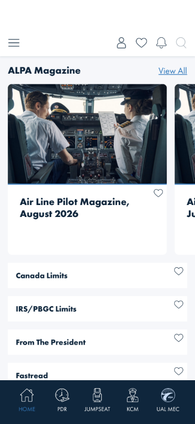
Default size (1.0×)
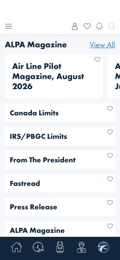
Largest accessibility size (2.0×)
What you should see: Headings, card titles and category rows are roughly twice the size and wrap
onto more lines. The tab bar shows its five icons only — larger than before, no text labels, evenly
spaced, the active one still highlighted. The ALPA Magazine cards have no photo: just the title
(and heart), in a card only as tall as its words.
Something's wrong if: Labels are still drawn under the icons (and overlap or run
off the edge); the icons are the same small size as before; the magazine card still shows its photo; or
the card is a tall white box with empty space under the title.
2 · Changing the size while the app is open
Steps: With the app open at your normal text size, switch to Settings, set the largest size, and
return to the app (do not force-quit). Then go back and restore your normal size, and return again.
What you should see: On each return the app is already at the new size — labels gone and icons
bigger at the large size, labels and photos back at the normal size — with no relaunch and no flash of
overlapping labels while it catches up. (On iOS the app reacts the moment the setting changes.)
Something's wrong if: The size only changes after a force-quit, the bar keeps its
labels until you navigate somewhere, or labels overlap in the moment between returning and the bar
redrawing.
3 · Lists and detail screens reflow
Steps: At the largest size, open KCM → Airports, then Jumpseat → Alaska Airlines
(any airline works).
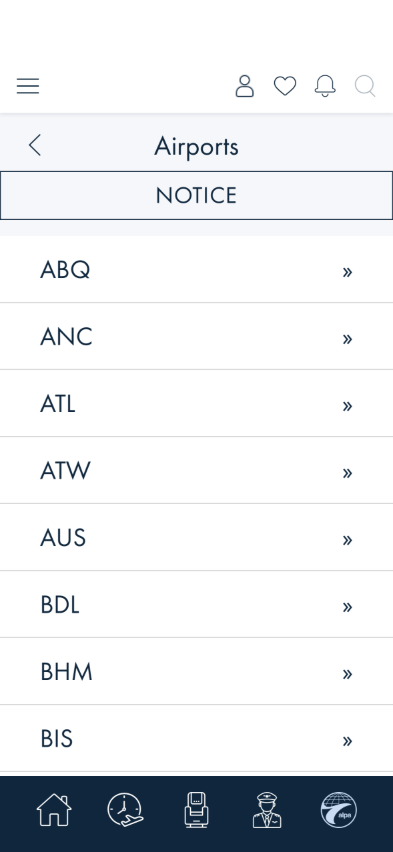
KCM Airports — rows grow taller, NOTICE bar and chevrons stay aligned
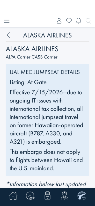
A jumpseat policy — paragraphs wrap inside the blue panel
What you should see: Rows are taller; codes, titles and paragraphs wrap inside their panels; the
NOTICE bar, back chevron and row chevrons stay in place; nothing is clipped; the icons-only bar is
on every screen.
Something's wrong if: Text is cut off mid-word inside a fixed-height box, text
spills outside its panel, or two pieces of text draw on top of each other.
4 · Buttons and links stay tappable
Steps: At the largest size, open Advocacy from Page Readiness.
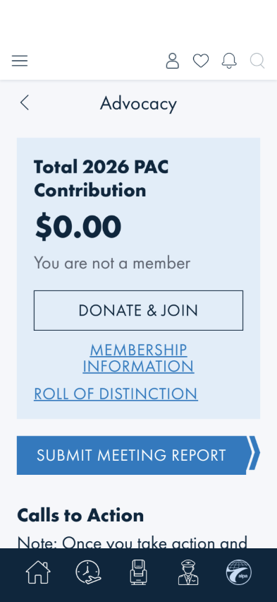
What you should see: The PAC card heading wraps to two lines; DONATE & JOIN and
SUBMIT MEETING REPORT are taller but whole; MEMBERSHIP INFORMATION wraps onto two lines and
is still one tappable link. Every control still responds to a tap.
Something's wrong if: A button's caption disappears or is cut off, a link wraps
into two separate-looking pieces, or a control no longer responds.
5 · The menu drawer keeps its MY MEC card at the bottom
Steps: At the largest size, open the ☰ menu.
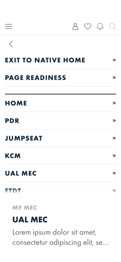
What you should see: The menu rows are bigger and the list scrolls (the last visible row
fades out — drag up to reach FTDT, MEMBER CARD and the rest). The MY MEC card sits at the
bottom of the screen, without its photo — just MY MEC, the MEC name and the description — and does
not scroll with the list.
Something's wrong if: The card still shows its photo; the card floats in the
middle with blank space under it; only four or five rows fit and the list does not scroll; or the rows
wrap their caption onto two lines.
6 · ALPA web pages opened in the app scale too
Steps: At the largest size, tap the PDR tab (or any Advocacy link). Then set your text size
back to normal and return to the app.
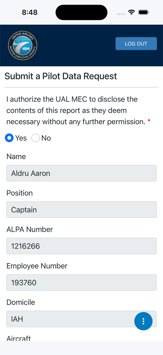
PDR at the default size
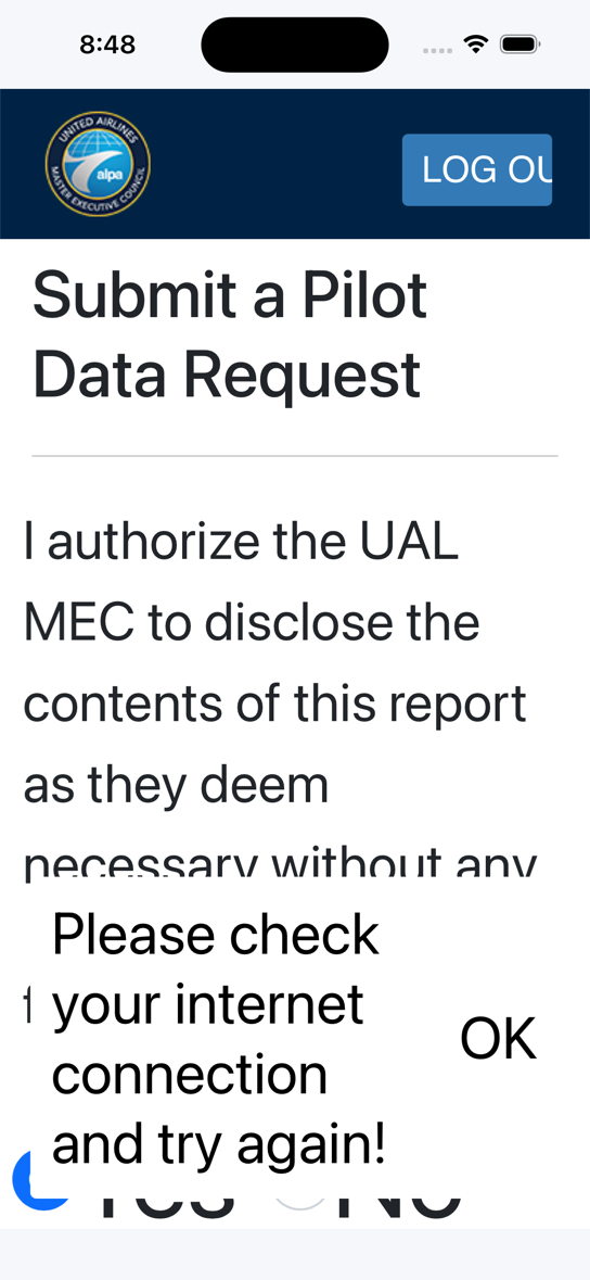
PDR at the largest size — text doubled, page reflowed, nothing zoomed sideways
What you should see: The web page's text is about twice as big and wraps to the screen — you do
not have to scroll sideways. Back at the normal size the page returns to its normal text without
reloading.
Something's wrong if: The web page text is the same size as at normal text size;
the whole page is zoomed so that it runs off the right edge and needs sideways scrolling; or the text
only changes after the page is reloaded.
Known, not a finding: some alpa.org pages have fixed-width buttons whose caption
clips at 2× (PDR's LOG OUT shows as "LOG OU"). That is the website's own styling, not the app.
What this checks, overall
That the app honours the phone's accessibility text size everywhere — the Blazor screens, the tab bar,
the drawer and the web pages it opens — reacts to changes live, and at the large sizes trades decoration
(labels under icons, photos on hero cards, the hero card's fixed height) for room for the words the
member asked to have enlarged (AB#2530, AB#2545, AB#2546).
What's not covered yet
Android — the checks apply as written (Android's 1.5× step and up take the large treatment;
the web view uses the platform's own text zoom), but every capture here is iOS.
Between sizes — XXXL (iOS, 1.32×) is the largest size that keeps labels and photos; that is by
design and not separately captured.
Bold Text / Increase Contrast / Reduce Motion — not covered.
Validated live 2026-08-22 on the iPhone 16 simulator for Checks 1, 3, 4, 5 and 6 and for the
live-change half of Check 2 (scale moved 1.0 → 1.32 → 2.0 and back with no restart).