Comms Notification Detail — Design Gap
The gap
A comms notification with no destination — ContentType empty —
has nowhere to send the member, so the notification's own text is the content. Native
still gives it a screen: PushNotificationsListPageViewModel.ShowContent,
case "", generates an HTML document from the title and message and shows it in a
WebView.
That screen has no Figma design. It is a generated HTML string in a view
model, styled with an inline @@font-face block for the Hind webfont — not a
designed surface. Like Jumpseat Etiquette and Mission, it ships today with no design source
behind it.
This is the most common row on the feed, not an edge case. Across 241 cached
production comms records the split was: WebLink 133, empty 83,
Document 21, DeepLink 4. Roughly one row in three opens this
undesigned screen. “ALPA System Maintenance” is a live example.
What ships today
| Aspect | Native (XAML) | Blazor (this build) |
|---|---|---|
| Surface | WebView showing a generated HTML document | Route /notifications/comms/{id} rendering markup |
| Content | Title, then message — and the banner shows the title too, so it reads twice | Title once, then relative send time, then message |
| Typography | Hind webfont at a fixed size, declared inline in the generated HTML | App type scale, so it responds to the OS text-size setting |
| Chrome | WebView page chrome | AlpaScreen title bar with a back chevron |
The Blazor version is a direct translation of what native shows, in the app's own components, because there was no design to build to. It is a placeholder for a decision, not a proposal.
A wrong turn worth recording. The first Blazor implementation made this tap
do nothing, reasoning that the card already renders the title and message so a detail view
adds nothing. That was wrong twice over: the row carries role="button" so it
announces itself as interactive, and native does open a screen. The result was a row that
looked tappable and silently did nothing — the same defect the routing work set out to fix,
just narrower. If the answer here is “no detail screen”, the row must also stop
presenting itself as interactive.
Side by side
The same notification on both builds — “ALPA System Maintenance”, sent
11/22/2024, ContentType empty. Captured on an iPhone 17 Pro Max simulator against
the live comms feed.
Native (XAML, shipped today)
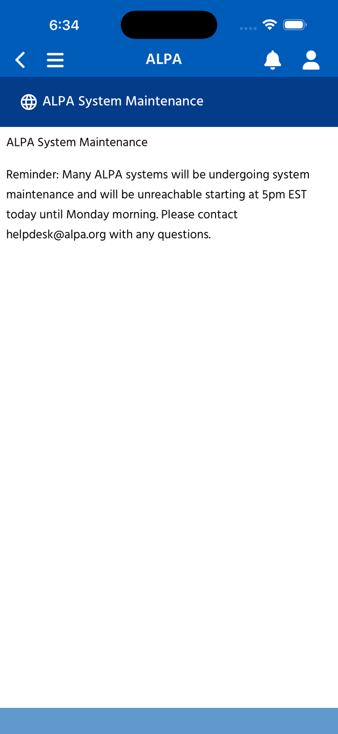
AuthenticatedWebViewPage + generated HTML (renamed from WebViewPage, AB#2591)
Banner carries a globe glyph and the notification title. Body is a WebView rendering a
string the view model builds from Title and Message — the title is repeated as the first
line of the document, so it appears twice. No send date. Hind webfont at a fixed size, so
the copy does not respond to the OS text-size setting.
Blazor (this build, for review)
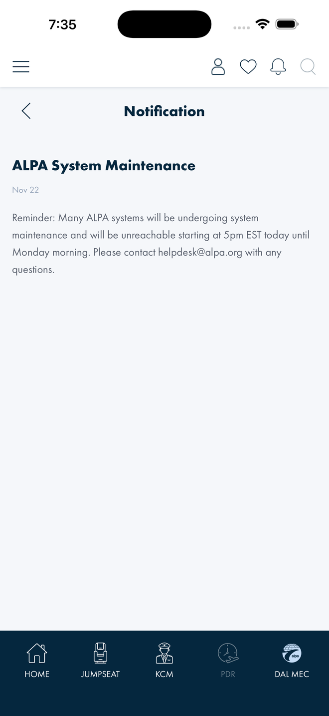
AlpaScreen + design-system type Title bar reads “Notification” with a back chevron; top nav and tab bar are present. The title appears once, as a heading, with the send date beneath it and the message as body copy. App type scale, so it grows with the OS text-size setting.
Neither column is a design. The native one is a generated string; the Blazor one is that string's content re-expressed in the app's components. The differences visible here — title shown once rather than twice, a send date added, scalable type — are the minimum needed to render it as a screen at all, not proposals.
Verification
Measured live on an iPhone 17 Pro Max simulator against the live comms feed:
Native was reached by the same route a member takes: bell → Notification Center → the
11/22/2024 row, which pushes AuthenticatedWebViewPage (PushNotificationHandler.cs,
renamed from WebViewPage, AB#2591). Blazor was checked for an error banner
after the tap — #blazor-error-ui computed display: none, so the page
rendered rather than failing silently.
Open questions
| # | For | Question |
|---|---|---|
| 1 | Design | Should a destination-less notification open a detail screen at all, or should the row be non-interactive and the list be the whole experience? Either is defensible; what is not defensible is the current native-and-Blazor state of a tappable-looking row whose screen nobody designed. |
| 2 | Design | If it keeps a screen, what belongs on it beyond title, timestamp and body? Audience or topic chips, a share action, and a mark-unread control are all plausible and none exists today. |
| 3 | Design | Should the other content types get the same detail screen for consistency — with the link or document opening from it — rather than the current split where three types leave the app or navigate away and one shows text? |
| 4 | Comms | Can messages contain markup? Today they are plain text (checked live: 0 of 53 rows contain tags, longest 197 characters) and Blazor renders them escaped. If rich text is ever intended, that changes the component. |
| 5 | Design | Is a relative timestamp (“Nov 22”) right on the detail screen, or should it be the full send date and time? Native shows neither. |
References
ALPAMobile/Components/Pages/CommsNotificationDetailPage.razor— the Blazor screenALPAMobile.Presentation/ViewModels/PushNotificationsListPageViewModel.cs—ShowContent,case "", the generated HTML- Jumpseat Etiquette & Mission — Design Gap — same class of gap: a screen that ships with no design source behind it
- XAML → Blazor Coverage Map